Download
1 / 23
230 likes | 361 Vues
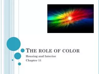
The role of color. Housing and Interior Chapter 11. Color Associations. Meanings of colors vary with different cultures, although many people share the same thoughts about certain colors: America: Brides wear white. India: Brides wear red. Europeans: Black for mourning.

E N D
The role of color Housing and Interior Chapter 11
Color Associations • Meanings of colors vary with different cultures, although many people share the same thoughts about certain colors: America: Brides wear white. India: Brides wear red. Europeans: Black for mourning. Africans: Black symbolizes strength. Chinese: Black indicates happiness.
Color and Mood • Color influences how people feel and can be used to create moods: Red: Bold, Excited, Nervous. Orange: Friendly, Hopeful, Energetic. Yellow: Cheerful, Friendly, Happy. Blue: Serene, Formal, Subdued.
Temperature analogy: Red-Orange-Yellow=Sun and Warmth. Blue-Green-Purple=Water, Earth, Sky, and Coolness Use these to create a feeling you want in a room.
Color Illusions • Colors can be used to fool the eye: Warm colors make objects appear closer. Cool colors make objects appear farther away. Therefore, make a small room appear larger by painting with a cool color. Use a darker color to make a ceiling seem lower, or a lighter color to make a ceiling appear higher.
Color Illusions • Bold, brighter colors make objects stand out and grab attention: A dark item on a light wall seems to take up more space than a light item on a dark wall. 1. Why are ceilings painted white? 2. What would be the best treatment for a long, too-narrow room? - 2 options
What is Color? A. Color exists in light which is made up of energy rays which have different wave lengths. The rays of light bend to varying degrees. Long red rays bend the least, short blue-violet rays bend the most. B. All objects contain pigments, substances which absorb some rays and reflect others. The reflected rays are the ones people see. When light strikes a blue object, all rays are absorbed except blue. If no light is reflected, the object is black. If all light is reflected, it is white.
Color Wheel • Primary Colors:Red, Yellow, and Blue 1. Appear equal distance apart on the wheel. 2. Can’t be created by mixing other colors, BUT most other colors can be made by mixing these primary colors. • Secondary Colors:Orange, Green, and Violet 1. Made by mixing equal parts of two primary colors. 2. Appear halfway between the primary colors used to make them.
Color Wheel • Tertiary (Intermediate) Colors:Red-Orange, Yellow-Orange, Yellow-Green, Blue-Green, Blue-Violet, Red-Violet (Name has the primary color first). Created by combining primary colors with the neighboring secondary color.
Color Language • Hue: color name however, black, white, and gray have no hue – they are neutral colors. • Intensity: brightness or dullness of a color. • lessened by mixing color with its complimentary color on the color wheel (opposite) • Intense colors – bright and stimulating; grabs attention. Seems larger and closer than less intense colors • Less Intense colors – muted, grayed. Create a calm effect
Color Language • Value: amount of black and white in a color Colors on the wheel are of middle value. Add white, lighten the color = tint Add black, darken the color = shade Adding black or white doesn’t change the color!
Color Scheme An arrangement or combination of colors that creates a mood, set a tone in an area. Monochromatic– uses tints and shades of ONE color on the wheel – produces a quiet restful effect…calm… – can make a room appear larger. -Use paint chips to create… under ELMO…
Color Scheme • Analogous – uses two or more colors that are next to each other on the wheel – it is better to use a grouping with a primary, secondary, and tertiary color. – relaxing when in same value – best if one color dominates and smaller amounts of the other are added for variety.
Color Scheme Complimentary – uses two colors directly opposite each other on the color wheel. Mood – stimulating, lively, bold, dramatic, Hint – best if one color dominates
Color Scheme • Split Complimentary – uses three colors; one color and the two colors on each side of its compliment. • Double Complimentary – use two colors and their compliments…4 total colors are used. • any combo of pairs will work…as long as each pair is composed of complimentary colors.
Color Scheme Triadic – uses any three colors that are equal distance apart on the color wheel. Creates Energy!
Color Scheme Neutral– uses black, white, and gray. • Beige and brown are not neutral colors, but blend well and are often considered neutrals. • Usually a bright color is introduced as an accent. • Often a combination of textures is used for interest.
Planning a color scheme Color schemes must suit the place and purpose for which they are intended. Factors to consider: • Room style and architectural features - Match authentic colors with style…western. • Room mood – Active (warm) or subdued (cool), formal or informal, sophisticated or casual. • Established colors in the room (art, wood) – take these into account when establishing a color scheme. • Adjacent rooms – select color schemes that donotclash….gradual transition…analogous then split compli. • Lifestyle – kids (dark colors to hide dirt!)
Planning a color scheme • Amount and type of light – Natural and artificial light: Sun (natural) Incandescent (warm) Fluorescent (cool) • In a “cool” light room, warm it up with color; in a “warm” light room, cool it down with color. • Remember that natural light shows objects in their true color • Incandescent and fluorescent light distorts color • Frosted and colored light bulbs also distort color.
Selecting colors • Choose the dominant color first. How?? • Favorite color • Color in a focal point • Color that sets the mood • Choose other colors by using the color wheel or looking through magazines. Also use the colors in a focal point, wallpaper, etc. • Use tints and shades; save pure intense colors as accents • Always choose colors you really like and would be comfortable with
Selecting colors • Colors gain intensity when applied to large area…select a few tints lighter than desired. • Too many strong contrasts is confusing • 2/3rd's of the room should be adominate color ….with all color schemes. • Textured surfaces make a color look darker…bring sample fabrics with you! • If large – select shades, warmcolors, high-intensity colors to make smaller • If small – select tints, coolcolors, low –intensity colors to make it look larger
Selecting colors • Too many strong contrasts is confusing • 2/3rd's of the room should be adominate color ….with all color schemes. • Textured surfaces make a color look darker…bring sample fabrics with you! • If large – select shades, warmcolors, high-intensity colors to make smaller • If small – select tints, coolcolors, low –intensity colors to make it look larger