Download
1 / 20
200 likes | 424 Vues
Web Site Organization. A web site is a collection of linked pages typically starting from some home page Often, the organization of the web site creates a tree-like structure (root node or home page is at the top, and then it branches outward/downward)

E N D
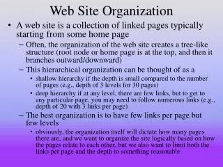
Web Site Organization • A web site is a collection of linked pages typically starting from some home page • Often, the organization of the web site creates a tree-like structure (root node or home page is at the top, and then it branches outward/downward) • This hierarchical organization can be thought of as a • shallow hierarchy if the depth is small compared to the number of pages (e.g., depth of 3 levels for 30 pages) • deep hierarchy if at any level, there are few links, but to get to any particular page, you may need to follow numerous links (e.g., depth of 20 with 3 links per page) • The best organization is to have few links per page but few levels • obviously, the organization itself will dictate how many pages there are, and we want to organize the site logically based on how the pages relate to each other, but we also want to limit both the links per page and the depth to something reasonable
Some Math • Consider a hierarchy of n nodes with 2 links per page • This creates a hierarchy of log2 n depth • if n = 100, the hierarchy will have a depth of about 7, or a maximum of 6 clicks from home page to any other page • If there are 4 links per page, we have a depth of log4 n • if n = 100, the hierarchy will have a depth of about 5 or a maximum of 4 clicks from home page to any other page • Now consider a hierarchy of depth 2 • This creates an initial web page that contains n – 1 links, 1 click to get to any page • too many choices, if n = 100 then there would be 99 links on the home page • What is our best option? • We want to minimize the depth, so we want a large number for our log base (a large number of links per page), but we want to limit the number of links, so we want a small number for our log base • if our site has 1000 nodes, lets use base = 5 • Log5 1000 < 6 • so we have 5 links per page and a depth of between 5 and 6, not a bad compromise
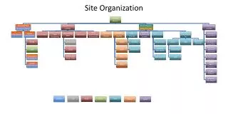
Site Map • If you create a diagram of the layout of your website organization, this is called a site map • The site map might be graphical, but more commonly, it will display the web page names and list them in an indented form to show how the pages relate Home Dept1 People P1 P2 P3 P4 Functions F1 F2 F3 Dept2 People …
Organizations • The most common organization of web pages will be hierarchical as already discussed • In general, you want to make it so that a user can reach where they need to go from the home page to any other page within 3 clicks (thus, no more than 4 levels) • Linear organization – pages must be accessed sequentially • This is the case when you have next and previous links but no other way to navigate • only use this organization when you want the user to access material sequentially, as with a story or information that might accompany a lecture • Random organization – the organization looks random in that there is no clear (or sensible) path from one page to another • This approach would almost never be used unless you want a very creative yet not user-friendly web site • See figures 5.9 and 5.11 in the textbook for these example organizations
Web Site Navigation • The main keys are to have a website that • Is easy to navigate: use breadcrumbs and navigation bars • breadcrumbs are links at the top of the page which denote the parent pages in the hierarchy (how did I get here? how do I get back?) • a navigation bar will usually run along the left-hand side of the page and allow the user to move away from the given page easily • Is sensible to navigate: use hierarchical organization • Other good practices • Keep web pages fairly short (no more than 3 screen lengths, but even better if a page is short enough to not require a horizontal scroll bar) • longer pages can be intimidating, and can also take more time to load • If a web page is long enough, create a “table of contents” at the top of the page where the entries are links to locations on the page (we cover this in chapter 7) • see http://grants.gov/applicants/applicant_faqs.jsp for an example • Create a site map
How to Create Breadcrumbs • Breadcrumbs are a list of links that take you to parent pages • Each page will have a different set of breadcrumbs • Consider our previous hierarchy with pages such as Home, Dept1, People, P1 (person 1) • From page P1, the breadcrumbs might look like this: • Home Dept1 People • The html code for this breadcrumb would look like this: • <a href=“home.html”>Home</a> <imgsrc=“../IMAGES/right_arrow.gif”> <a href=“dept1.html”> Dept1</a> <imgsrc=“../IMAGES/right_arrow.gif”> <a href=“People.html”>People</a> • Each of these is a link to the proper page • From the People page, you would only see Home Dept1 • Since each page will have a unique set of breadcrumbs, you will probably want to wait on adding the breadcrumbs until your site is complete • If you add breadcrumbs when you create each page and then you decide to move some pages around, you will have to redo the breadcrumbs
Navigation Bar • Navigation bars can be text-based or graphical • Navigation bars usually run along the left-hand side or the top • left-hand side is usually preferred but see www.jpl.nasa.gov for an alternative • Two general forms of navigation bar • Static bar – looks the same for every page • usually the links of such a bar will only point to top level items • for instance, go to the Department of Computer Science home page (http://informatics.nku.edu/csc/index.php) and click on any of the links – you will get the same navigation bar • Navigation bar changes in one of two ways • the bar is specialized for the new page (has new links) • go to www.nku.edu and click on any of the links you will see a new navigation bar on the left • the bar expands as you continue down a branch
Design Principles • Repeat visual elements throughout the design • Come up with a format and have all of the pages follow that format (or at least the top-level pages) • Use contrast on a specific page to draw the user’s attention to something • Contrasting colors, or contrast an image with the background • Group related items close together on the page • Links for instance should be grouped together and links of the same type should be grouped together • for instance, you might have three groups of links, overarching links at the top, navigation on the side, and page specific links in the middle or bottom • Align elements to create visual unity • Related items should be aligned either horizontally or vertically
Web Page Design: Considerations • Load time – as stated in chapter 4, try to keep load time to a minimum • Limit the images on any given page, limit the image sizes • calculate page storage capacity (.html file + .css file + images) and make sure it is <= 60 KB • Perceived load time – break a longer page into several smaller pages • if the user views all of the pages, it takes the same amount of time (or more) the user may not notice since it is now split among 2-4 pages • lessening the impact on image load time can be done through image slicing (see chapter 4) • Place the most important page information in the first screen’s worth • that is, above the point where the user needs to scroll
Continued • Use the best “real-estate” • Typically, this is the upper-left and upper-middle of a web page as this is the area that draws users’ viewing first and foremost • Avoid placing navigation bars on the right side (may not be displayed without scrolling) or below the first screen’s worth • Avoid requiring horizontal scrolling • Test your web page on several browsers AND several screen resolutions (we revisit this idea later) • Use adequate white space • Don’t use too little or the page might look crammed together, but don’t use too much or your page might look sparse • White space around graphics can make the graphics stand out • Know your audience and target the design for them • Use appropriate color (based on target audience age and sex) • E.g., children prefer bright colors, young adults prefer dark colors • Use appropriate graphics • Add sound effects or music based on the target audience
Testing Your Page(s) • To see how your page will load, don’t just try it in different browsers • IE • Mozilla • Opera • Mac, Linux and Windows • Also test it in different screen resolutions • Users usually use 1024x768 or 1280x1024 pixel resolution • But some will use 800x600 and a page that looks good for 1280x1024 may require horizontal scrolling in 800x600 • One way to avoid the problem of screen resolution is to always center your page • You can center your text by placing • <div style=“text-align: center”>…</div> around all items within the body of your page • You can also center your entire page by using a wrapper (we cover this in a few slides)
Web Page Design: Layout • What are the elements of your web page that you have to design? • Text – single column or multiple columns? • Graphics – will images be placed amid the text, or to one side? Will there be a logo/title at the top? • Links – is there one set of links? Are there groups of links associated with text (or images)? • Web site design – are you going to use the same basic layout for all pages on your website? • Accessibility concerns – will everything fit within one screen’s worth? If not, how do you want to divide it up? Is there any reason to require horizontal scrolling? • Will the page have an address portion in the footer? • Will there be different “regions” on the screen? For instance a log-in region on the right, a navigation bar on the left, etc?
Continued • Start with a wireframe layout (a sketch or blueprint) that denotes the structure • For instance, you might have a logo at the top, a navigation bar below it, three columns of material that include text and graphics, and a footer at the bottom • See the example to the right • Design a format for each of these regions • You might want a common format so that the page looks coherent • You might want different formats so that certain features stick out • Web authoring tools allow you to experiment with formats • For us, we will have to experiment using XHTML and CSS
Types of Page Layouts - Ice • Ice is a fixed layout where the page “hugs” the left margin • Changing the browser’s size does not impact how the page looks • In order to ensure that a page will fit in any browser, you might force the width to be < 800 px by defining a wrapper, as in • #wrapper { width: 750 px; } • You now place the entire body in the wrapper by doing <body><div id=“wrapper”>…</div></body> • the entire body of the page goes inside the <div>…</div> tags • you might use 750 px (anything less than 800 px) because 800 px is usually the lower limit on screen resolution • if someone has reduced the size of their browser to something smaller, they will still have to scroll horizontally, but making the wrapper be much smaller than 700 px might make it look peculiar (too narrow) • Note that if you do this and the user is using a resolution that is wider, the user will most likely see plenty of white space on the right of their browser
Types of Page Layouts - Jello • The Jello layout allows for either a fixed sized width (like Ice) or a variable sized width • You can specify the width in either px (fixed) or % (variable based on the current size of the browser) • Additionally, jello centers the contents of the web page so that any white space appears to both the left and right hand side of the content • We accomplish a Jello layout by again using a wrapper but with two sets of specifications • The width (again, in % or px) • The left and right margins set to auto for center justification of the entire web page • #wrapper { width: 80%; margin-left: auto; margin-right: auto; } • <body><div id=“wrapper”>…</div></body>
Types of Page Layouts - Liquid • The liquid design is the best form of layout • As you change browser size (or use different resolutions), the content will take up 100% of the window by readjusting itself • This may cause text to be stretched to reach across 100% width • In order to create a liquid layout, you can use either CSS or XHTML • with CSS, create a wrapper whose width is 100% • with XHTML, create a table whose width is 100% of the column and insert all of the web page items into the table (we will explore the use of tables for layouts in chapter 8) Ice and Liquid
Text Design • Use common fonts that should be available in all computers browsers • e.g., Arial, Verdana, Times New Roman • The sans serif fonts (e.g., Arial, Verdana) tend to be easier to read than serif fonts (e.g., Times New Roman) • Font displays smaller on a Mac than a PC, the default size of font is larger on Firefox than IE • Use appropriate color combinations (text and background) so that the text is easily readable • Use multiple columns if possible • Only use bold <strong> and italics <em> to highlight specific portions of text, not all of text • Hyperlink only keywords or phrases, not entire sentences • Avoid using phrases like “click here” • Try to avoid long sections of text (lengthy paragraphs) • Keep paragraphs down to a few sentences, try to keep sentences short and to the point • Spell and grammar check!
Graphics Design • Use colors on the web palette to ensure that the colors will look consistent across platforms • Use antialiased text in images • antialiasing introduces extra coloring to smooth jagged edges in images • Adobe Photoshop and Fireworks can create antialiased text images • compare figure 5.33 to 5.34 • Use only necessary images, don’t add images just because you want them (remember, images cause lengthier load times) • Limit animated graphics • Keep images small • Make the site usable even if images are not displayed • create text links as well as image links • use alt in your img tags for alternate text • Allow users to skip navigation and jump right to desired content (see figure 5.39 with the “skip navigation links”)
Design for Accessibility • Keep in mind that not all users will be the same • Some visitors may have handicaps that limit how they can use your web pages such as • limitations on mouse usage or movement • fewer links are better to prevent a user from having to use the mouse a great deal • limited or no hearing • sounds and recordings of people speaking can enhance a page but there should be some alternate available such as closed captioning • color blindness • limit colors and do not put one colored text over another colored background unless the colors are very different • difficulty reading small print • use reasonable sized font • limited access in terms of speed
Accessibility Tips • Images and animation should use the alt attribute to describe each visual, graphs should use longdesc • Image maps should be available for easy and quick navigation that largely avoids using the mouse for a lot of links • Multimedia can provide captioning of audio, descriptions of video • Hypertext links should have useful, descriptive text • Pages should be organized with headings, lists, and a consistent structure and format • Provide alternative formats for JavaScript, Java applets and Flash in case a user does not have the proper access/plug in • Use <noframes> for a user who does not have frame capability • Tables and text should be proofread for sensibility and correctness