Download
1 / 76
770 likes | 1.05k Vues
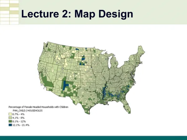
GIS Lecture 2 Map Design. Outline. Vector GIS Graphic Elements Colors Graphical Hierarchy Choropleth Maps Map Layers Scale Thresholds Hyperlinks. Vector GIS. Graphic Features on the World. GIS Map. Vector GIS. Point. Points. Line. Lines. Polygon. Polygons. Points.

E N D
Outline • Vector GIS • Graphic Elements • Colors • Graphical Hierarchy • Choropleth Maps • Map Layers • Scale Thresholds • Hyperlinks
Vector GIS Point Points Line Lines Polygon Polygons
Points Data Attached to Points
Points Same data displayed as two different points Burglaries Drug Calls
Queries and Restrictions • Restricts the features to a specific subset
Lines Roads Conditions, Major Streets Curbs
Polygons Point Polygons Line Green Spaces Polygon Buildings Census Tracts or Blocks
Jacques Bertin Visualization Information “What should be printed to facilitate “communication”, that is, to tell others what we know without a loss of information” -Jacques Bertin, Paris, February 1983
Value Hue Orientation More Value Saturation Size Bertin’s Graphic Variables Shape Texture
Value Hue Orientation Shape Texture More Value Saturation Size Point Symbols
Value Hue Orientation More Value Saturation Orientation Shape Texture Size
Value Hue Orientation Shape Texture More Value Saturation Size Polygon Symbols
Texture • Black and White Prints • Polygons • Large Areas
Texture • Brings object to the front (figure) • long wavelength hues • coarse texture
Value Hue Orientation Shape Texture More Value Saturation Size 1-3 4-9 >9 Size – Point Symbols
Size Graduated Symbols Show Size or Amount
Value Hue More Value Saturation Values Orientation Shape Texture Size
Values • Increase/Decrease Contrast • The greater the difference in value between an object and its background, the greater the contrast.
Values • By creating a pattern of dark to light values, even when the objects are equal in shape and size, it leads the eye in the direction of dark to light
Value Hue Orientation Shape Texture More Value Saturation Size Color Hues
Value Hue Orientation Shape Texture More Value Saturation Size Color Values
Value Hue Orientation Shape Texture More Value Saturation Size Saturation
Saturation • You can change the saturation of a hue by adding black (shadow) or white (light). The amount of saturation gives us our shades and tints.
Saturation • Customize the Properties…of a layer
Color Hues and Values Each of individual color is a hue Colors have meaning (i.e. cool colors, warm colors, political meanings) -Cool colors calming -Warm colors exciting -Cool colors appear smaller than warm colors and they visually recede on the page so red can visually overpower and stand out over blue even if used in equal amounts. www.colormatters.com www.colorbrewer.org
red orange violet yellow blue green Color Wheel
Color Wheel • Harmony • two adjacent hues red orange violet yellow blue green
Color Wheel • Harmony • two adjacent hues red orange violet yellow blue green
Color Wheel • Harmony • two adjacent hues red orange violet yellow blue green
Color Wheel • Harmony • two adjacent hues • Contrast • two hues with one hue skipped in between red orange violet yellow blue green
Color Wheel • Harmony • two adjacent hues • Contrast • two hues with one hue skipped in between red orange violet yellow blue green
Color Wheel • Harmony • two adjacent hues • Contrast • two hues with one hue skipped in between red orange violet yellow blue green
Color Wheel • Harmony • two adjacent hues • Contrast • two hues with one hue skipped in between red orange violet yellow blue green
Color Wheel • Harmony • two adjacent hues • Contrast • two hues with one hue skipped in between Clash • Opposites red orange violet yellow blue green
red orange violet yellow blue green Color Wheel Review • Harmony • two adjacent hues • Contrast • two hues with one hue skipped in between Clash • Opposites
<-4 -4 to -2 -2 to 2 2 to 4 <=4 Double-Ended Scales • Extremes Emphasized • critical value of zero • e.g., regression residuals, time change • blue and red contrast • white center is ground red white blue
0-20% orange 20-40% 40-60% yellow 60-80% 80-100% green Double-Ended Scales • Balance Emphasized • 50% is desired • yellow contrasts with white paper • green and orange contrast
Color Spot White background allows yellow color spot to be visualized