Download
1 / 7
70 likes | 192 Vues
Learn about nominal, ordinal, interval, and ratio scales with qualitative & quantitative data representations like bar charts, pie charts, histograms, and stem-and-leaf diagrams. Use examples to grasp the concepts effectively.

E N D
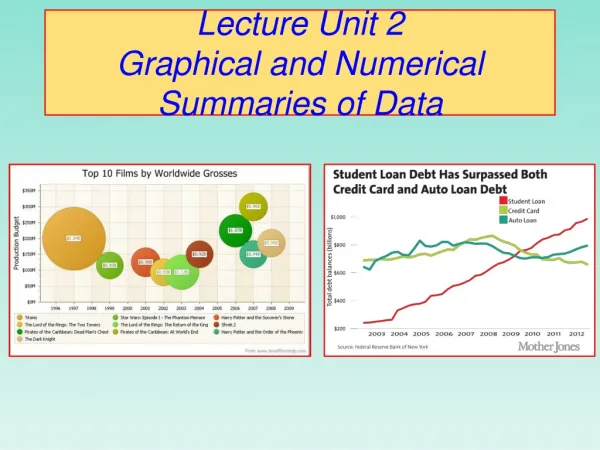
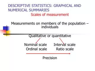
DESCRIPTIVE STATISTICS: GRAPHICAL AND NUMERICAL SUMMARIES Scales of measurement Measurements on members of the population – individuals Qualitative or quantitative Nominal scale Interval scale Ordinal scale Ratio scale Precision
Nominal and Ordinal scales • Nominal scale: individuals classified into groups depending on their attributes • EXAMPLE: Gender: M or F • Colors: White, Red, Blue. • Ordinal scale: Add order to nominal scale. • EXAMPLE: Grades: A, B, C, D, F • T-shirt size: S, M, L, XL.
Interval and Ratio scales • Interval scale: • mments are numerical values, • differences make sense, • intervals of equal length signify equal differences in the characteristic, • zero does not signify absence of the characteristic. • EXAMPLE: temperature. • Ratio scale: • like interval scale, but • has “absolute zero”, i.e. zero means absence of the characteristic. • EXAMPLE: height, weight.
GRAPHICAL SUMMARIES: qualitative variables • Bar chart Example. According to the National Center for Health Statistics, the 6 leading causes of death in 1995 are: heart disease, cancer, stroke, pulmonary diseases, accidents, and others.
GRAPHICAL SUMMARIES: qualitative variables • Pie chart. A disc (pie) is divided into “slices” proportional to the number of observations (frequency) in each category. • Relative frequency for each category. For example, heart disease 738/2312=0.3192 of the total. • Angle corresponding to each category= relative frequency x 360. For heart disease, 0.3192 x 360=116 degrees.
GRAPHICAL SUMMARIES: Quantitative variables • HISTOGRAM: Shows frequency distribution – where the values are and how frequently they occur. • Example: Over 50 days a statistics course web site had the following number of “hits” per day: 20, 14, 21, …etc. (see text pg.14) • Frequency Table: relative frequency= frequency/total number of obs.
GRAPHICAL SUMMARIES: Quantitative variables • Stem and leaf diagram. “ A bar chart drawn side ways”. • Stem: 1-2 leading digits. • Leaves: trailing (remaining) digits. • Example: Stem-and-leaf plot for the web site hits data stem leaves 0 89 1 1344 1 5667789 2 0122333 2 5566667889 3 01223 3 5699 4 1233 4 69 5 12 5 55 6 3