Download
1 / 36
360 likes | 482 Vues
Explore the various types of map distortions, propaganda maps, thematic maps, and how data manipulation can skew perceptions. Learn to question if maps can truly be trusted.

E N D
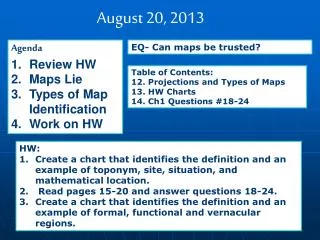
August 20, 2013 • Agenda • Review HW • Maps Lie • Types of Map Identification • Work on HW EQ- Can maps be trusted? Table of Contents: 12. Projections and Types of Maps 13. HW Charts 14. Ch1 Questions #18-24 • HW: • Create a chart that identifies the definition and an example of toponym, site, situation, and mathematical location. • Read pages 15-20 and answer questions 18-24. • Create a chart that identifies the definition and an example of formal, functional and vernacular regions.
All Maps Lie.... Because the world is a sphere and maps are flat, there will always be some degree of distortion. The next several slides will display some of the more popular distortions.
Projection- method of transferring locations on the Earth’s surface • Types of Distortion: • Shape • Distance • Relative Size • Direction
Good for showing accurate shape, polar areas much larger than real life
Shows shape and size accurately but distorts location Advertised as the non-racist map
Sizes are good relative to each other, some shape distortion “Equal Area Projection”
Propaganda Maps- maps that lie with a political purpose German map pre-WWII to show the threat of Czech bombers
Types of Thematic Maps
Dot Maps Use a concentration of dots to show locale of specific characteristic
Proportional Symbol US Population Shape gets larger depending on concentration
Choropleth Map Color shading to show degree of concentration
Using your text books, atlases and the post-it notes, locate and “label” one map of each type. Show these to me for a grade when complete!
Scale Displaying the same geographical features at various scales may also depict misleading results.
This map shows the total number of African-Americans per state. Examine Georgia.
In the previous slide, Georgia had one of the highest number of African-Americans, but a closer look tells a different picture. The dark red is the Atlanta metropolitan area.
Using Census Tracts of the Atlanta Metropolitan Area, a different scale gives different results.
Manipulating Data Data may also distort desired results. The following slides show how population of a particular cohort may be misleading.
This map shows the percentage of African-Americans living within counties across the US.
This map shows the total number of African-Americans living in each county across the US.
These four New York counties (New York, Kings, Queens, and Bronx) have a combined African-American population of 2,121,882 and outnumbers the total number of African-Americans in the entire state of Texas 2,021,632
A similar comparison can be made with Hispanics living in the US. This map shows the total percentage of Hispanics in each county.
This map displays the total number of Hispanics in each US county.
These three Southern California counties (Los Angeles, Orange, and San Diego) have a total Hispanic population of 5,045,726 which is greater than the total Hispanic population of Texas at 4,339,905. New Mexico has the greatest percentage of Hispanics (33%), it’s total Hispanic population is 579,224.
US Population The map below shows the US population divided into Natural Breaks. In this case, the natural breaks are near the 7,000,000 mark.
US Population This map shows US population in Quintiles. In this map, states are classified into five separate categories based on population. The dark red represents the states in the top one-fifth. The total population in each state has not changed; however, the way that it is classified has changed.
Natural Breaks Quintile