Download
1 / 24
250 likes | 417 Vues
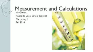
Learning Targets….I can. 1. identify and define data in a scientific lab (during the development of a hypothesis and during testing of the hypothesis) 2. create an appropriate table/chart based on the data to be collected during an experiment.

E N D
Learning Targets….I can • 1. identify and define data in a scientific lab (during the development of a hypothesis and during testing of the hypothesis) • 2. create an appropriate table/chart based on the data to be collected during an experiment. • 3. read and understand a table/chart and graph to create a valid conclusion. • 4. create and appropriate graph using the data collected in the table/chart.
Learning target 1:identify and define data in a scientific lab (during the development of a hypothesis and during testing of the hypothesis) • Jargon- a specialized vocabulary used to describe things in a specific field of study. • Data- is information. Data from an experiment is obtained by making observations. • Three examples of data. • 1. • 2. • 3.
Learning Target #2 create an appropriate table/chart based on the data to be collected during an experiment. • Data table- a way to organize data in columns so it is neat and readable. • Title- a brief way to describe the content of a book, graph, or data table. • Variable- a word used in a data table to describe what information is being collected. • Unit- a word or symbol used in a data table that tells how the information was measured.
Data is organized in a data table. • Ordered pairs- two pieces of data directly corresponding to one another.
A complete data table • A properly constructed data table follows these guidelines: 1. A descriptive title 2. Variables describing what information has been collected. 3. Units telling how those variables were measured. 4. Data collected in ordered. 5. All work done neatly.
It’s your turn! • Create a table using the data that you gathered in brainstretcher #1 • If you already created one, change it somehow. Ex change the direction
Learning target #3 Read and understand a table/chart and graph to create a valid conclusion. • What is a graph? • A graph is a picture of information in a data table. • Everything that a data has also has to be in a graph. • The same descriptive title • The same variables and units • The same data.
Parts of a graph • Horizontal axis- the axis that goes across the bottom of the graph. • Vertical axis- the axis that runs up and down on the side of the graph. • Intersection- the crossing of two lines when graphing. • Data point- the place where the two data lines cross (or intersect). • Plotting- finding the data point for an ordered pair.
Plotting a line graph Guidelines • Always use graph paper. • Draw all lines with a ruler. • When drawing a horizontal and vertical axes start no less than three squares from the bottom of the paper and three squares from the left side. • Do all work in pencil
Plotting a line graph • A complete graph has a descriptive title, both axes labeled correctly, data points plotted neatly, and a line connecting data points drawn with a ruler. • Use a whole piece of graph paper to do a graph.
Steps to plotting a line graph • 1. Draw the horizontal and vertical axes using your ruler. Be sure to indent three spaces. Vertical Axis Horizontal Axis
Steps to plotting a line graph • Decide which variable is the most consistent. The most consistent variable is labeled on the horizontal axis. Label the vertical axis with the other variable (this is the one that is changing). • Number each axis in even intervals. Intervals are determined by looking at the smallest and largest number in the data table. • Plot the data points.
Steps to plotting a line graph • Line up the data points with a ruler, and connect the dots. • Be sure to copy the descriptive title from the top of the data table onto the top of the graph.
Best fit graphs • Best fit Graph- a graph with a line passing through many but not all plotted points. Best fit graphs allow scientists to predict various unplotted points on a graph. • You construct a best fit graph the same way you do a line graph. • The difference comes when you draw the line. You draw a smooth line or curve that goes through as many points as possible but still remains smooth.
Best fit graphs • Reasons best fit graphs are valuable: • 1. Best fit graphs allow us to predict information by showing a representative curve of the data collected. • 2. Best fit graphs save time because they can be plotted using a small sample of data.
Learning target #3 and #4 • Kinds of graphs • There are three major types of graphs: Bar graphs, line graphs, and circle graphs • 1. Bar graph • Has bars • Used to compare measurements, amounts, and changes • Can be horizontal or vertical • The greater the bar length or height, the greater their value.
Number of police officers in Crimeville, 1993-2001 How many police officers were in Crimeville in 1998? How many more police officers were in Crimeville in 1998 than 1996? In which year do you think saw the largest increase in crime? 1. 49 2. 7 3. 1996
Line Graphs • Line Graphs • **Built from pairs of numbers **. • Each pair expresses a relationship between two factors, or variables. • Line graphs are useful for showing changes that occur in related variables. • The can also help answer if/then questions.
Line Graphs Which age had the highest donation amount? 19 year olds Which age had the lowest donation amount? 15 year olds How many 17 year olds donated money? On this graph, you can not tell. How would you have to organize the graph to tell this information? What pieces of data would you need to know?
Pie Graphs or Circle graphs • Pie charts are an easy way to visualize percentages. They are useful for analyzing polls, statistics, and managing time or money.
Pie graphs or circle graphs • Organize your data. First gather your data. • Add it all together. Add all of the numbers to get a denominator. • Then find the numerator. Find the numerators by taking each part of the data, these are your numerators. • Convert your fractions to a decimal. Divide your numerator by your denominator. • Convert the decimal to a percent. Move the decimal two places to the right. • Find the angle. Multiply the decimal by 360 (degrees in a circle), or multiply the percent by 3.60 to get an angle.
Pie Graphs or circle graphs • Use a mathematical compass to draw a circle. If you don't have a compass, try tracing something round such as a lid or a CD. • Draw the radius. Start in the exact center of the circle and draw a radius to the outside of it. ( Hint: make a dot with the compass to find the center. ) • Place your protractor on the circle. Place your protractor on the circle so that the 90 degrees are directly above the center of the circle. • Draw each section. Draw the sections by using the angles you got in step six. Each time you add a section the radius changes to the line you just drew. • Good Job! You are done!.
Lets create our own circle graph about what toppings on pizza are most liked by 6th graders. • Try this website to see if your own circle graph matches theirs. • http://nlvm.usu.edu/en/nav/frames_asid_183_g_1_t_1.html?open=activities
Other Graphing Resources • http://www.shodor.org/interactivate/activities/PieChart/ For pie charts • http://www.shodor.org/interactivate/activities/Histogram/ For histograms • http://www.shodor.org/interactivate/discussions/HistogramsVsBarGraph/ For a discussion between histograms and bar graphs.