Download
1 / 1
70 likes | 334 Vues
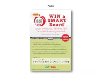
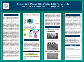
# 14458. Poster templates for the modern poster presenter. Flip Phillips & Donna X. Tent, Department of Psychology and Neuroscience Program. http://ebv.skidmore.edu, {d-tent|flip}@skidmore.edu. Instructions. On Story Telling.

E N D
# 14458 Poster templates for the modern poster presenter Flip Phillips & Donna X. Tent,Department of Psychology and Neuroscience Program. http://ebv.skidmore.edu, {d-tent|flip}@skidmore.edu Instructions On Story Telling Welcome to the infamous poster template. It dates back several years and over the past while I have made some changes and updates. Furthermore, I have provided some additional suggestions and hints to help make your poster a more positive experience for everyone. Please note that if you really want control over the process of poster making PowerPoint is a very poor tool. Adobe Illustrator is far and away the best tool for the job (Not Photoshop in general). This template is designed for the quick-and-dirty throwing together of your work. If you have designerly aspirations use another tool. Your poster (and any presentation or paper actually) should tell a story. Structure your poster this way. Filmmakers use a technique called storyboarding to structure their work before committing it to film. You should be doing the same sort of thing. The poster can basically be this storyboard. Use images if at all possible to tell the story. Remember, you’ll be there to ‘pitch’ the story so you want the best possible props. Images & data are your friends. If you forgot how to handle a story arc you might want to refer to the writing center or some of your previous classes. One good form is setup-exposition-conclusion (plot twists are excellent tools if your results suggest them). The whole pitch for the poster should take about 5 miuntes. Don’t wear out your audience! When I have more time I’ll add to this. As for now, enjoy and share any changes / improvements / hints with me, flip@skidmore.edu On Typography • It goes without saying that folks will be reading your poster. However, you will be there presenting it, so a too much text is really a waste of space. Your poster is not a duplication of your longer, written work. Folks do not want to spend all day reading. To this end there are several things you can do to make this process more enjoyable for all - • Keep the text large. 36 point at a minimum. • Less is more. Small blocks of text, terse descriptions are best. • This document is set using two main face families- Helvetica and Palatino. Choose others if you know what you’re doing. Serif fonts (like Palatino) are allegedly more legible, but I have had good success using sans serif fonts in the body of the poster, especially since there are few words on most of mine. Arial is bad. Avoid Arial. Same with Times, it is way overused, avoid. • Reading requires contrast. Set dark type on light backgrounds, light type on dark backgrounds. You may want to set all body text in bold. It looks better on the cheaper paper we use. On Graphs and Pictures Finally… A picture is worth a bunch of words. When it is clearer, always use a diagram of the experiment setup, a flow chart of the model you are proposing, or equations if you’re so predisposed. Emphasis- This box can be used for emphasis. Don’t change the text color, black on this dark looks bad when it prints. It’s OK to ‘break the grid’ sometimes, like this box does. Remember, 1 out of every 8 or 9 men that read your poster will be color blind. Red-Green colorblind specifically. If you are using a chart or graph please don’t differentiate between conditions based on red/green lines. Use blue/green. As a rule-of-thumb, use Photoshop to prepare ‘images’ (things made up of pixels) and use formats like TIFF, GIF, and JPG for them. For drawings and graphs, use a drawing program to edit & color them. The Microsoft suite has some tools built in. Alternately, use Illustrator. Use pictures when appropriate