Download

1 / 5

E N D
Saul and Elaine Bass Independent research task
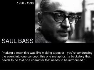
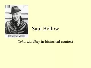
Saul Bass Saul was an American graphic designer. He cooperated with quite famous film production companies such as 20th Century Fox, Columbia Pictures Corporation, Paramount Pictures etc. He is well known for the film title sequences he has done for some of Hollywood’s most prominent filmmakers but, he also worked on airlines and restaurants logos, and lots of different companies designs. Here are examples of the posters he designed for the films “Vertigo” and “Anatomy of a Murder”.
Elaine Bass Manypeopleknow her as Saul'swife, butthisisn’t fair to her as she has achievedsuccessherself. Togetherwith her husband, shecreatedmanyprojects, but not theonlysuccessfulones in her career. Whenthey first met, shewasinterviewing for thecompany Saul worked for. For 4 yearsheentrusted her withimportanttasks, sheevenbecame a co-designer oftheopeningtitle to oneof his most famousworks "Spartacus". The nextyeartheygotmarried and startedtheirfamilylife, butshedidn’tquit her jobevenafter giving birth to twochildren. ‘Spartacus’ title sequence
‘The Man withthe Golden Arm’ ‘The man with the Golden Arm’ is a film adaption of Nelson Algren’s novel about drug (some sources tell that the drug was never named in the film but others write that it was heroin) addicted jazz musician which Bass was making title sequence and the poster for. Drugs was a taboo subject in mid-century America so Saul had to create the title sequence that mirrored the main theme of the film without resorting to sensationalism. He decided to put an arm image as a central one connoting a straight relate to heroin addiction. The whole opening sequence consists of the white lines as design elements which gather in a general picture of a white outstretched hand which is a symbol of the film. Choice of the black background was a clever decision to show that the storyline could be unbearable tough for some viewers as black color always connotes negative emotions. Saul himself claimed that, “The intent of this opening was to create a mood spare, gaunt, with a driving intensity… [that conveyed] the distortion and jaggedness, the disconnectedness and disjointedness of the addict’s life the subject of the film.”
Here is a short video that helped me better understand Saul’s works and his point of view on the art of graphic design.