Responsive and Adaptive Web Design
Responsive and Adaptive Web Design. By: Chad W. Stoker (MCTS, MCP, MCAD) President & Chief Technology Officer. Responsive Web Design means what??? Hardware form factors… Re-thinking web layout… As always, balance between existing skill-sets and project priorities….

Responsive and Adaptive Web Design
E N D
Presentation Transcript
Responsive and Adaptive Web Design By: Chad W. Stoker (MCTS, MCP, MCAD) President & Chief Technology Officer
Responsive Web Design means what??? • Hardware form factors… • Re-thinking web layout… • As always, balance between existing skill-sets and project priorities… Responsive Web Design intro
HTML5 – This should be the new target for all of your web development. Think about how to achieve this with ASP.NET versus ASP.NET MVC. • Fluid Grids • Fluid Images • Media Queries • CSS3 • Javascript Tools
Modernizr • http://www.modernizr.com/ • Example: • if (Modernizr.canvas) { • // let's draw some shapes! • } else { • // no native canvas support available :( • } • W/O Modernizr : return !!document.createElement('canvas').getContext; Pre-requisites (1)
HTML5 shim for IE… (http://code.google.com/p/html5shiv/) • <!--[if lt IE 9]> <script src="http://html5shim.googlecode.com/svn/trunk/html5.js"></script> <![endif]--> • CSS3 Media Queries Shim… (http://code.google.com/p/css3-mediaqueries-js/) • <!--[if lt IE 9]> <script src="http://css3-mediaqueries-js.googlecode.com/svn/trunk/css3-mediaqueries.js"></script> <![endif]--> • Note: Doesn't work on @import'edstylesheets (which you shouldn't use anyway for performance reasons). Also won't listen to the media attribute of the <link> and <style> elements Pre-requisites (2)
The goal: Your first Responsive design…
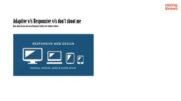
1,024 pixels and above (Desktops and Laptops) • Between 1,024 and 700 pixels (tablets) • 700 pixels and below (phones) Standard screen-sizes
Using the “float” CSS attribute • Remembering your HTML5 tags • Remembering your backward-compatibility issues • Keeping it to just 2 columns max • Keeping the content to simple text that wraps. • Float settings… Starting out easy
Identifying where a “Fluid Grid” can be constructed. • Calculating width… • Demonstrate how Border, padding, margins, etc affect the wrapping behavior. Making it a bit more tricky…
Now we’ve got something… • Welcome - @media CSS! MEDIA QUERIES IN ACTION…
What about my static top navigation width? • Demo… Navigation Options
http://www.zeldman.com/ • http://easy-readers.net/books/adaptive-web-design/ (Book) • http://www.alistapart.com/articles/responsive-web-design/ • http://www.w3.org/TR/css3-mediaqueries/ (W3WC Media Queries) More Information at…

