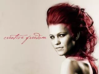
Project 2: Color Photography
Project 2: Color Photography. Cristian Galindo. Analogous Color.

Project 2: Color Photography
E N D
Presentation Transcript
Project 2: Color Photography CristianGalindo
Analogous Color Analogous colors are colors that are next to each other on the color table. In this Picture you can see that the colors that are next to each other are the colors of the pineapple. In the color table. The light green is right next to the yellow making those color analogous colors.
Complimentary Color For this Picture complementary colors are colors that are opposite of each other in the color wheel. The colors in this picture that are complementary are the blue-green colors where it says iced and the bottom words that say with raspberry have the blue-green’s complementary color which is red orange.
Monochromatic Color What monochromatic means is that there is only one color. For this picture, I took a picture of my super man cape. This cape was red and I tried taking a picture of its texture. In my attempt I got a monochromatic color because it is only red.
Gradient Color Gradation is when there are different shades of black and white. The middle looks like it is shiny with white. Then as you get out to the edges it starts to get more and more darker.
Contrast Contrast is when there is a real big difference between black and white. For this the black and white patterns of the zebra design have a high contrast because the colors are strikingly different.
Warm Color For this picture we can see warm colors. Warm colors are colors like red yellow and orange. For this picture the purse is yellow with a little orange and the background is red. That is why it is a warm color picture.
Cool Color Cool colors are colors like blues purples and greens. For this picture the cool color is the one of the roses.
Saturated Color Saturated is like a bright and colorful. For this picture we can see saturated colors in the flowers. They are like really bright yellow and bright red orange colors.
Unsaturated Color Unsaturated is like a washed out color. For this picture, the grey is like a washed out black type of color.