Thursday, April 12 th
680 likes | 832 Vues
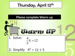
Thursday, April 12 th. Warm UP. Please complete Warm up. Solve: Simplify 4 ³ ÷ 12 + 5. TOMORROW IS GAME DAY!!!. CW Grade. Algebra. Whiteboard Review. Evaluate: 4m when m=.4 4 x .4. =1.6. Find the sum 22.3 + 5.23. 27.53. Evaluate: (10-5+7) + 4 . 28. Find the value: 3 . 81.

Thursday, April 12 th
E N D
Presentation Transcript
Thursday, April 12th Warm UP Please complete Warm up Solve: Simplify 4³ ÷ 12 + 5
CW Grade Algebra
Evaluate: 4m when m=.4 4 x .4 =1.6
Find the sum 22.3 + 5.23 27.53
Evaluate: (10-5+7) + 4 28
Find the value: 3 81
Find the value 1 1
Subtract 2 – 0.4 1.6
You have 16 yards of material. You need to make costumes for the holiday play. If each costume requires ¼ yd of material, how many costumes can you make? 64
Question Find GCF of 24 and 80 8
Question Solve .5x = 30 60
Data & Probability
Easy to read • Graphically shows data ~A graph that uses pictures or symbols to represent data
Easy to read • Graphically shows data ~A graph that uses pictures or symbols to represent data ~ A graph that uses vertical or horizontal bars to display data • Used to compare quantities • Each bar represents a different category * Double Bar graphs compare two groups in each category.
Easy to read • Graphically shows data ~A graph that uses pictures or symbols to represent data ~ A number line with marks or dots that show frequency ~ A graph that uses vertical or horizontal bars to display data • Shows the shape and distribution of data • Can easily be turned into a histogram • Used to compare quantities • Each bar represents a different category * Double Bar graphs compare two groups in each category.
Easy to read • Graphically shows data ~A graph that uses pictures or symbols to represent data ~ A bar graph that shows the frequency of data within equal intervals • Groups data into numeric intervals • Shows the shape and distribution of data ~ A number line with marks or dots that show frequency ~ A graph that uses vertical or horizontal bars to display data • Shows the shape and distribution of data • Can easily be turned into a histogram • Used to compare quantities • Each bar represents a different category * Double Bar graphs compare two groups in each category.
Easy to read • Graphically shows data ~A graph that uses pictures or symbols to represent data ~ A bar graph that shows the frequency of data within equal intervals • Groups data into numeric intervals • Shows the shape and distribution of data • Used to show change over time • Time should always be displayed on the x-axis ~ A graph that uses line segments to show how data changes ~ A number line with marks or dots that show frequency ~ A graph that uses vertical or horizontal bars to display data • Shows the shape and distribution of data • Can easily be turned into a histogram • Used to compare quantities • Each bar represents a different category * Double Bar graphs compare two groups in each category.
Easy to read • Graphically shows data ~A graph that uses pictures or symbols to represent data ~ A bar graph that shows the frequency of data within equal intervals • Groups data into numeric intervals • Shows the shape and distribution of data • Used to show change over time • Time should always be displayed on the x-axis ~ A graph that uses line segments to show how data changes ~ A graph that uses sections of a circle to compare parts to the whole and parts to other part ~ A number line with marks or dots that show frequency • Used to compare quantities • Represents percents of data • All sections must add up to 100% ~ A graph that uses vertical or horizontal bars to display data • Shows the shape and distribution of data • Can easily be turned into a histogram • Used to compare quantities • Each bar represents a different category * Double Bar graphs compare two groups in each category.
If 150 people are surveyed, how many people would you expect to like cherry pie? If 300 people are surveyed, how many people would you expect to like apple pie?
Depending on the data to be displayed, some types of graphs are more useful than others.
Example #1 A table shows the miles jogged by five boxers. Which graph would be more appropriate to show the data-a line plot or a line graph? Defend your answer
10 11 12 13 14 15 16 17 18 Think: is the information in the table describing the frequency of values? Is it describing a change over time? A line plot table shows the frequency of values on a number line. So a line plot table is more appropriate than a line graph table. xx x x x
#2 The table shows the height of some plants. Which graph would be more appropriate to show the data-a bar graph or a stem-and-leaf plot? Defend your answer
Stems Leaves Think: The table shows a number of different heights. It does not compare data in separate categories. A stem-and-leaf plot shows how often data values occur. So a stem-and-leaf plot is more appropriate than a bar graph. 1 1 1 4 2 6 7 3 5 Key 2|6 means 26.
#3 A table shows the number of feet of grass each neighbor must mow. Which graph would be more appropriate to show the data-a line graph or bar graph? Defend your answer
Think: is the information in the table describing a change over time? Is the information in the table divided into different categories? The table shows the number of feet each neighbor mows. The data should be displayed in separate categories. So a bar graph is more appropriate than a line graph.
#4 The table shows the number of tickets each student purchased for the school carnival. Which graph would be more appropriate to show the data-a line plot or line graph?
1 2 3 4 5 6 7 8 9 Think: is the information in the table describing the frequency of values? Is it describing a change over time? A line plot shows the frequency of values on a number line. So a line plot is more appropriate than a line graph. xxx x x
Summary • What type of graph would you use to show change over time? Line Graph • What type of graph would you use to compare data? Bar Graph • What type of graph compares parts to a whole? Circle Graph • Which type of graph shows the frequency of data? Stem-and-Leaf, Line Plot, or Histogram
What is it? Probability is a measure of how likely an event is to occur
How to Write it • Probabilities are written as: • Decimals from 0 to 1 • Fractions from 0 to 1 • Percents from 0% to 100%
Theoretical Probability The probability of an event is written: P(event) = number of ways event can occur total number of outcomes
Theoretical Think…… In THEORY, what should happen?
Try These: 1. What is the probability that the spinner will stop on part A? B A C D • What is the probability that the spinner will stop on • An even number? • An odd number? 3 1 2 3. What is the probability that the spinner will stop in the area marked A? A C B
Don’t let them fool you! Unless they actually give you data, then just find theoretical probability Ex: John flipped the coin 10 times, how many times should it land on tails?