Download
1 / 16
290 likes | 698 Vues
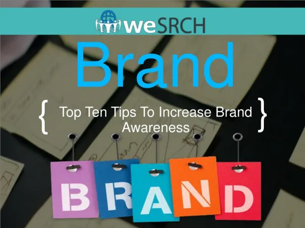
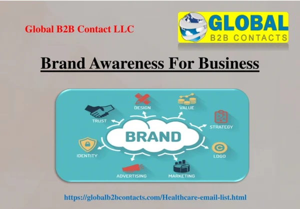
Brand Awareness. There are no prescribed success formulas, no secret color combinations or hidden shapes that dictate a logo’s success. The keys to great design can be found in a company’s name or business focus, or in the “intangibles” such as its mission or attitude. ~ Marks of Excellence.

E N D
Brand Awareness There are no prescribed success formulas, no secret color combinations or hidden shapes that dictate a logo’s success. The keys to great design can be found in a company’s name or business focus, or in the “intangibles” such as its mission or attitude. ~ Marks of Excellence
Logo Design and Identity “Trade marks are animate/inanimate/organic/geometric. They are letters/ideograms/monograms/color things. Ideally they do not illustrate/they indicate… not present/but suggest…/and are stated with beauty and wit.” ~Paul Rand
Paul Rand Paul Rand: Thought and despair on logo design
Design Fate – Serendipity and Typography Started as a red disk, inspired by Paris Metro nameplates Initial design had name printed across it in a bar Frank Pick, company attorney w/ no design experience, suggested inner circle would pull the eye if it were white, resulted in him becoming the company’s ID program director Commissioned typographer Edward Johnston to create open, highly legible, masculine typeface One of the world’s first sans-serif typefaces
Need for Flexibility Few design projects require as much flexibility in application as a logo Depending on your client, you may know at the onset that your creation not only will appear on stationary and business cards… more likely is that it will eventually be put to uses you can’t predict when you’re designing it. So, a sound flexible design is paramount.
Words and Pictures Many logos consist of both words and pictures – often a visual icon plus a specific treatment of the company’s name Others rely almost entirely on an image, or just words or letters No rule as to which approach is better Non-verbal images are more likely to translate well across international boarders
Jay Vigon – Complex Simplicity Jay Vigon - Essential Emotion
Makeovers Some logos may have a very long shelf-life, unchanged for decades Others get altered or updated – sometimes repeatedly Reasons for updating vary widely, sometimes confounding those viewing them Typically a logo update or redesign serves a specific business purpose As a business matures, it can become apparent that the visual brand needs updating Application opportunities and treatment are factors Diversification of products or services can drive a redesign or updating
Makeover Example New York City Library Makeover
Essentials Distilling a company into a single gesture or emotion that visual elements can convey is the core of the logo-design process The final result must balance timeliness with timelessness, trading simultaneously on trend and tradition. Whether the result is bold or subtle, innovative or conservative, the ultimate goal is to create a logo that stands out in a sea of business identities