102 Font review
350 likes | 441 Vues
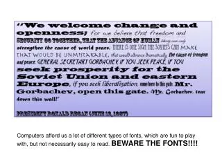
102 Font review. Susan Clements-Vivian. Illuminated manuscript. Psalter-Hours English, 13th Century A.D. Walters Art Museum, Baltimore, MD. Before the invention of the printing press, handwritten documents were riddled with errors .

102 Font review
E N D
Presentation Transcript
102 Font review Susan Clements-Vivian
Illuminated manuscript Psalter-Hours English, 13th Century A.D. Walters Art Museum, Baltimore, MD. Before the invention of the printing press, handwritten documents were riddled with errors. Scribesinvented visual, artistic ways to salvage these laboriously crafted objects.
Gutenberg’s moveable Type metal type Gutenberg’s moveable Type in Europe (1453-1455 A.D.)
Letterpress Typographic design is not only an act of mark making, but also of spacing. Letterpress technologya classic typographic page
Blackletter Gutenberg’s moveable Type style “Blackletter”
Type Classification Systems Essentially, classification describes typefaces; it does not define them.
Know Your Families: Grouping Fonts Reference: http://www.smashingmagazine.com/2010/12/14/what-font-should-i-use-five-principles-for-choosing-and-using-typefaces/ ***see Smashing Mag. (link above) to review font groupings
Humanist / Old Style / Venetian 15th – 16th century The Humanist types (sometimes referred to as Venetian) appeared during the 1460s and 1470s, and were modelled not on the dark gothic scripts like textura, but on the lighter, more open forms of the Italian humanist writers. **Note. In some classifications Humanist refers to Typefaces of the 15th century and Old Style of the 16th.
Humanist / Old Style / Venetian Examples of Old Style: Jenson, Bembo, Palatino, and — especially — Garamond, Old style is also called Humanist. Humanist Sans and Humanist are two different classifications. Humanist Sans is a 20th century variation of Humanist.
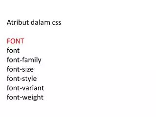
characteristics Sloping cross-bar on the lowercase “e”; Relatively small x-height; 3 Low contrast between “thick” and “thin” strokes (basically that means that there is little variation in the stroke width);
At Best, At Worst • Old Style faces at their best are classic, traditional, readable and at their worst are… well, classic and traditional.
Transitional (mid 18th Century) Examples of Transitional are Baskerville, Bookman (Linotype), Cheltenham (ITC), Clearface (ITC), Fournier, Joanna, Slimbach (ITC)
Modern (late 18th century) Examples Modern Bodoni and Didot.
Characteristics Characteristics 1. High and abrupt contrast between thick and thin strokes;2. Abrupt (unbracketed) hairline (thin) serifs3. Vertical axis4. Horizontal stress5. Small aperture
At Best, At Worst • At their best, transitional and modern faces seem strong, stylish, dynamic. At their worst, they seem neither here nor there — too conspicuous and baroque to be classic, too stodgy to be truly modern.
Geometric Sans Examples of Geometric/Realist/Grotesk Sans: Helvetica, Univers, Futura, Avant Garde, AkzidenzGrotesk, Franklin Gothic, Gotham.
characteristics • Geometric sans serifs are exactly what their name suggests; they are built on geometric shapes.
AT Best, AT Worst • These sans serifs are constructed of straight, monolinear lines and circular or square shapes. This can make them very cold and clinical, but also quite simple. The starkness of most geometric sans serifs makes for great headings, but they are usually less than ideal for long paragraphs. https://typekit.com/lists/geometric-sans-serifs
Humanist and Transitional Sans (20th century) Examples of Humanist Sans: Gill Sans, Frutiger, Myriad, Optima, Verdana.
Transitional Sans These are Sans faces that are derived from handwriting — as clean and modern as some of them may look, they still retain something inescapably human at their root.
AT Best, At Worst • At their best, Humanist Sans manage to have it both ways: modern yet human, clear yet empathetic. At their worst, they seem boring and mundane.
Slab Serifs / Egyptian Examples of Slab Serifs: Clarendon, Rockwell, Courier, Lubalin Graph, Archer.
In typography, a slab serif typeface is characterized by thick, block-like serifs. Serif terminals may be either blunt and angular (Rockwell), or rounded (Courier). Slab serif typefaces generally have no bracket (feature connecting the strokes to the serifs).
AT Best, At Worst • Slab Serifs are hard to figure out. At their best they can seem very urban and at others invoke the American frontier (wild west). At worst they overpower and become overly conspicuous in the wrong surroundings.
Selecting a font A large type family like Helvetica Neue can be used to express a range of voices and emotions. Versatile and comfortable to work with, these faces are like a favorite pair of jeans for designers.
Do they work together? Two typefaces work well together if they have one thing in common but are otherwise greatly different. This shared common aspect can be visual (similar x-height or stroke weight) or it can be from the same time period.
References • http://www.smashingmagazine.com/2010/12/14/what-font-should-i-use-five-principles-for-choosing-and-using-typefaces/ • http://www.smashingmagazine.com/2009/11/11/comic-sans-history-examples-best-practices/ • http://ilovetypography.com/2007/11/06/type-terminology-humanist-2/ • https://typekit.com/lists/geometric-sans-serifs • https://en.wikipedia.org/wiki/Slab_serif