Typography Guidelines and Design Principles
80 likes | 230 Vues
Learn about different font types, cautions when using typography, and four basic design principles for creating visually appealing content. Understand the importance of contrast, repetition, alignment, and proximity in design.

Typography Guidelines and Design Principles
E N D
Presentation Transcript
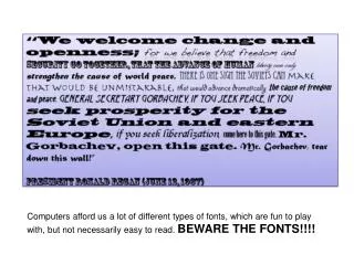
Computers afford us a lot of different types of fonts, which are fun to play with, but not necessarily easy to read. BEWARE THE FONTS!!!!
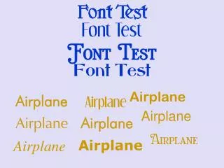
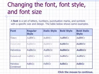
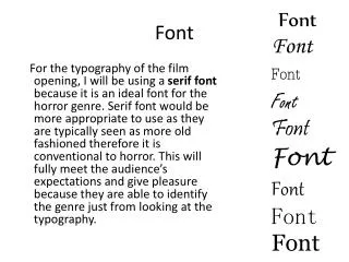
M SERIFS Sans Serif • Serif Type: small “feet” or horizontal strokes that extend from the main strokes of a letter. Good choice for body text and formal correspondence. • Sans serif type: Sans is French word for “without”. Lack the “feet” or horizontal strokes of serif typeface. • Can be used for body copy, but only in small quantities (brochure/short memo rather than long document like report/newspaper.) Typically used on websites, headings & technical material.
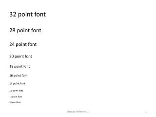
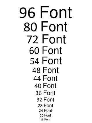
TYPOGRAPHY CAUTIONS: Sometimes emphasis is needed, like italic, bold, and ALL CAPS. Don’t go below 12-point type for most body text – this includes any website designs or documents. In some typefaces, 12-point will be a bit small, so base your decision on how the font looks when printed. Italics are used like a highlighter or magic marker, to set words apart and draw attention to those words. Too much bold will lose its appeal. Good for headings, subheadings, or parts of a sentence you want to emphasize. Use selectively. Never forget that your point is to communicate. Different typefaces should enhance the communication, not confuse it.
Justified vs. Unjustified Text A;lskjdf;lkajsd;lf as;dlfj as;ldkjfals;dkjfals dkjflaskdjf l;sakdfsdlfkhasd fkasjdh flkjasdh flkajshdf kljasdhf lkajsdhf lkajsdhflk asjhdflk asdlkfjha sdlkfjhas dlkfjhasldkf jhaslkdjhf askldjhf laksdjfh laksd jhflaksdjhf lkasdjhf lkasdjhflkasjdhf lkasjdhf lkasjdhf lkasjdhf lkasjdhfl kajshdflkjahsdlfkjhasd lkfsdlkfjhasldkjfh aweufwaeuhf lkajwneflawe fn asldfjn asldif auwehf awndf lausdfaue fliuanwe lfnaelf asliudfl asenf lasef liasudnflaesnf aklejn flaisdufl aisudnflaksdjn fkase fiuaehfliasndfkasdn flkawelf iuaelnfkajsdnf lkasdifuhaslen faweiue lwaeh lajsen A;lskjdf;lkajsd;lf as;dlfj as;ldkjfals;dkjfals dkjflaskdjf l;sakdfsdlfkhasd fkasjdh flkjasdh flkajshdf kljasdhf lkajsdhf lkajsdhflk asjhdflk asdlkfjha sdlkfjhas dlkfjhasldkf jhaslkdjhf askldjhf laksdjfh laksd jhflaksdjhf lkasdjhf lkasdjhflkasjdhf lkasjdhf lkasjdhf lkasjdhf lkasjdhfl kajshdflkjahsdlfkjhasd lkfsdlkfjhasldkjfh aweufwaeuhf lkajwneflawe fn asldfjn asldif auwehf awndf lausdfaue fliuanwe lfnaelf asliudfl asenf lasef liasudnflaesnf aklejn flaisdufl aisudnflaksdjn fkase fiuaehfliasndfkasdn flkawelf iuaelnfkajsdnf lkasdifuhaslen faweiue lwaeh lajsen • Bullets vs. Numbers • Bullets: Don’t use fancy icons when a plain round dot will do. • Numbers: Use when instructing audience to perform a series of steps.
4 Basic Design Principles: Contrast If the elements (type, color, size, line thickness, shape, space, etc.) are not the same, then make them very different. Contrast is often the most important visual attraction on a page – it’s what makes a reader look at the page in the first place. • Repetition • Repeat visual elements of the design throughout the piece. You can repeat colors, shapes, textures, line thickness, fonts, sizes, graphic concepts, etc. This develops the organization and strengthens the unity. • Alignment • Every element should have some visual connection with another element on the page. This creates a clean, sophisticated, fresh look. • Proximity • Items relating to each other should be grouped close together. You don’t see a side of beef mixed in with the apples at the grocery store, so be careful. There is an acronym to help remember these principles…I’ll leave that to you to figure out.