A Change Heat Map
40 likes | 58 Vues
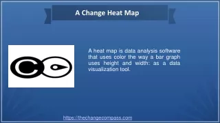
A heat map is data analysis software that uses color the way a bar graph uses height and width: as a data visualization tool. Visit our website to know more.<br>

A Change Heat Map
E N D
Presentation Transcript
A Change Heat Map A heat map is data analysis software that uses color the way a bar graph uses height and width: as a data visualization tool. https://thechangecompass.com
About Us The Change Compass was launched in 2015. Since that time we’ve been working with select clients to introduce and embed best practices and the tool within their businesses. During this time, we’ve come to realize the power of data in change management. We’ve seen that business stakeholders have matured how they manage change through understanding the data and tweaking their approaches over time. As a result, the role of change management professionals has moved up the scale to be leading more strategic conversations and interventions. https://thechangecompass.com/
What is The Change Compass? The most advanced change management software to manage cumulative changes on employee, customer and business capacity. Graduate beyond change heatmaps, and influence business decisions through insights from change velocity, change volume, time capacity, scenario planning, strategy alignment and doability assessment. https://thechangecompass.com
Contact Us • Social Link https://twitter.com/thechangecompas https://www.linkedin.com/company/thechangecompass https://thechangecompass.com/