Experience Serenity: Gondola Rides in Venice, Italy
100 likes | 234 Vues
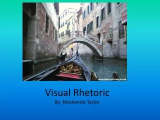
Step into the tranquil beauty of Venice with this captivating ad for a gondola company. Set against the backdrop of historic Italian architecture, the image evokes a sense of peace as you imagine gliding through serene canals, away from the hustle and bustle. With vibrant colors contrasting the monochromatic background, the gondola stands out, inviting travelers to indulge in a unique experience. Though devoid of people, the photo captures the essence of solitude and exploration, drawing the audience to learn more about this enchanting destination.

Experience Serenity: Gondola Rides in Venice, Italy
E N D
Presentation Transcript
Background Information • This ad is an add for a gondola company in Itlay • This picture was taken in Venice Italy in 2008 • Gondolas were a traditional boat used to get around Italy therefore a big tourist attraction.
What do you see in the ad? In this ad you see the historic Italian buildings. Also you can see the front of the boat as if you were on a gondola ride.
What is omitted from the picture? There are no people shown in this image. This creates the feeling that you are on a gondola ride and that you are looking out over the front of the boat. Also it creates a peaceful feeling making you feel all alone and away from all the noise of the world.
Contrast In this picture there is a contrast in the colors. The background is very monochromatic. This makes the front of the gondola stand out from the rest of the picture.
Who is the intended audience? This add intrigues everyone. Especially travelers because they are the people who might actually visit Italy.
Why do you think there isn’t writing on the ad? This photograph speaks for itself. When you see this picture you are intrigued therfore you want to learn more. Writing on the photograph would take away from the eye catching appeal.
Appeals? Ethos- The interrail-italy website in the bottom right corner Pathos- This image makes you want to travel and to have the opportunity to go on a gondola ride. Logos- Obviously you want to see Italy since it is this beautiful
Citation Interrail. Interrail-italy, 12 April 2008. Web. 23 Sep. 2013.
