Newspaper Design Read ALL ABOUT it!
200 likes | 337 Vues
Discover the essentials of designing a captivating front page for tabloid newspapers. This guide covers key formats, including broadsheet and tabloid sizes, and emphasizes the importance of layout, with details on incorporating elements such as headlines, photos, and captions. Learn the step-by-step process of organizing teasers, placeholders, and story modules effectively. We highlight design tips to ensure visual appeal, emphasizing the use of dominant images, balanced layouts, and consistent margins. Perfect for aspiring newspaper designers looking to create an impactful front page!

Newspaper Design Read ALL ABOUT it!
E N D
Presentation Transcript
Newspaper Design Read ALL ABOUT it!
Newspaper pages come in a variety of sizes, but the two most common formats are broadsheet (13 1/2” x 21”) and tabloid (10 1/4” x 16”).
Front Page News Is formatted into 5 columns per page for a TABLOID size paper.
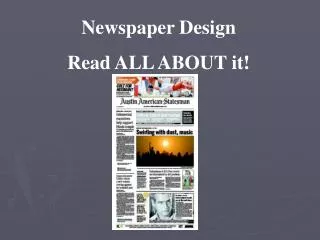
Graphics on the FRONT PAGE • Broadsheets (Austin American-Statesman) and tabloid (The Paw Print) formats incorporate the same basic elements: • headlines, text, photos and captions.The front page will have some additional design elements, such as a nameplate (or flag) and teasers.
Step 1 – Placing the Teasers and Nameplate on the Spread • Place the standing elements on the page first. The standing elements include the nameplate and teasers. • Teasers can go above the nameplate across the page, across the bottom of the page or down one side of the page. • When these are placed on the page, there should be a rectangular space left for the front page story.
Notice on your handout where the skyboxes are placed and where the nameplate is included.
Step 2 – Adding DUMMY text and photo boxes • Determine how many stories will be placed on Page One, along with headlines, artwork, photographs, captions, sidebars, etc. • For a tabloid layout, one or two stories will be sufficient. • If you have more than that, the stories will have to jump to a • different page, a practice readers and judges do not like very well. • Dummy in the modules that will make up your page by using placeholder text. If you have one story, you will have one module. If you have two stories, there will be two modules.
Place your stories on the page, dividing them into columns of equal length. The first column should provide room for the byline at the top of the column. The number of columns will depend on the size of your artwork or photograph, and the number of other elements you have to go with the story. • The top story on the page should have the dominant photograph. If there are two photographs on the page, the bottom photograph should be on the opposite side of the page from the top photograph to achieve balance. • Leave room for your headline, which should go either above the story or to the left of the story. • Make sure that the columns line up at the top and bottom.
This illustration is an example of a DUMMY module with placeholder text.
Step 3 – Adding Photos and Captions • Carefully place your photographs or artwork on the page. • Photographs require captions which should be placed below, above, or adjacent to the photographs. Allow room for a photo credit for each. Artwork requires a credit as well. • Place your captions. Captions should be set no more than 2 columns in width. A three column photo’s caption can be divided into two 1 1/2-column legs. If captions are adjacent to the lower part of the story, as in the illustration, make sure the captions line up with the stories on the bottom edge.
Adding Headlines, Bylines, Subheads, Sidebars and Photo Credit • Finish the page by placing the headlines and the bylines for the stories. Double check to make sure the internal margins remain consistent. There should be one pica of space between elements, unless your specific newspaper layout style calls for a different measurement. The example to the left is modular. The elements for Story 1 include the headline, story with byline, photo and caption. This entire package forms a rectangular module. • Story 2 consists of a photo with caption, headline, subhead, story with byline and a sidebar. All of the elements in this package form a rectangular module. • In addition, the teasers and nameplate form another module.
Design Tips • All story packages should be shaped like rectangles. • Every page should have a dominant photo or artwork. • Every story must have a headline. • Every photo must have a caption. • Use no more than three typefaces per page, including the typeface used in the nameplate. • Headlines should get smaller as you move down the page.
Graphics include: • Rule lines, • Screens and tints, • Photographs or artwork, • Planned white space and • Infographics.
Screens can give the effect of color even if using only black and white.
Infographics are • Graphs (from surveys) • Charts (from polls) • Sidebars (Quick Reads or Stats)
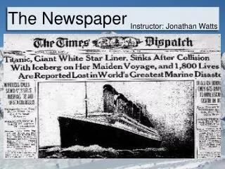
We will recreate this front page together. Note that not all the copy will fit since this paper is a broadsheet and we are using a tabloid template.
