Relationships Between Variables in Data Analysis
Understand scatter plots, correlation coefficients, and causation in data analysis. Learn how to interpret and analyze relationships between numerical data.


Relationships Between Variables in Data Analysis
E N D
Presentation Transcript
Chapter 10Relationships between variables • Definition • A Scatter Plot is a picture of bivariate numerical data in which each observation ( ie each pair of values (x,y)) is represented by a point located on a rectangular co-ordinate system. The Horizontal Axis is identified with values of x and the vertical axis with values of y.
Example:Draw a Scatter Plot to represent the following dataset:x: 1, 3, 2, 4, 7, 6, 5 y: 4, 2, 5, 6, 9, 8, 7
Another Example:Draw a Scatter Plot to represent the following dataset:x: 1, 3, 2, 4, 7, 6, 5 y: 4, 6, 1, 3, 2, 4, 1
QuestionAny comments on these two datasets? Is there anything special about them? • Looking at a scatter plot can sometimes allow us to determine if a relationship exists between two variables. • But in general we need to go beyond pictures and develop a numerical measure of how strongly the two variables x and y are related.
Definition • Pearson’s Sample Correlation Coefficient, r, is a measure of the strength of the linear relationship between two variables x and y.
Properties of r • The correct interpretation of r requires an appreciation of some general properties: • The value of r does not depend on the unit of measurement for either variable, nor does it depend on which variable is labelled x or y. • The value of r is between -1 and 1. • A positive value of r indicates a positive linear relationship between the variables. So as x increases so does y. • A negative value of r corresponds to a negative relationship. As x increases y decreases.
The value r = 1, which indicates the strongest possible positive relationship between x and y results only when all points in the scatter plot lie exactly on a straight line that slopes upward. • The value r = -1, which indicates the strongest possible negative relationship between x and y results only when all points in the scatter plot lie exactly on a straight line that slopes downward.
The value of r is a measure of the extent to which x and y are linearly related i.e. the extent to which the points in the scatter plot lie close to a straight line. • A value close to zero does not rule out any strong relationship between x and y; there could still be a strong relationship but one that is not linear.
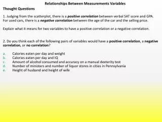
Examples For each of the following pairs of variables, indicate whether you would expect a positive correlation, a negative correlation or no correlation. • Minimum daily temperature and heating costs • Interest rate and number of loan applications • Incomes of husbands and wives when both have full-time jobs • Ages of boyfriends and girlfriends • Height and IQ • Height and shoe size • Your Maths score in the Leaving Cert and your Irish score in the Leaving Cert
Correlation and causation • Years of research have established several facts: • There is a strong correlation between the numbers of storks in a country and the number of births in that country. Countries with many storks have a high number of births and countries with low stork counts have low numbers of births. • There is a high correlation among primary school children between vocabulary and numbers of tooth fillings. Children with many fillings have a larger vocabulary than children with only a small number or with no fillings.
Correlation and causation • What should we conclude from these facts? • That storks really are responsible for bringing babies. • That eating Mars bars will increase your vocabulary. • No, these examples illustrate a very important point. • Correlation is not the same as causation.
Correlation and causation • Larger countries have larger stork populations and usually have higher human populations as well and so there will be higher numbers of babies born than in smaller countries. • Young children have very few fillings because they have only been around for a few years whereas older children have had time to eat lots of sweets, get a lot of bad teeth and learn a lot of new words. • So be careful before you interpret a correlation as causation. It may be that a third confounding variable is causing the correlation: Size of country, Age of child.
Least Squares Introduction • We have just mentioned that one should not always conclude that because two variables are correlated that one variable is causing the other to behave a certain way. However, sometimes this is the case, eg: interest rate and number of loan applications. • In this section we will deal with datasets which are correlated and in which one variable, x, is classed as an independent variable and the other variable, y, is called a dependent variable as the value of y depends on x.
Least Squares • We saw that correlation implies a linear relationship. Well a line is described by the equation • y = a +bx • where b is the slope of the line and a is the intercept i.e. where the line cuts the y axis. • The intercept a is just the value that y takes when x is zero. • The slope b is how much y increases by when x increases by one unit.
Suppose we have a dataset which is strongly correlated and so exhibits a linear relationship, how would we draw a line through this data so that it fits all points best? • We use the principle of least squares, we draw a line through the dataset so that the sum of the squares of the deviations of all the points from the line is minimised.
Regression • Suppose we have a dataset and we have calculated the equation of the Least Squares Line • y = a +bx • Then we can use this line to predict a value for Y if we know a value for X. • Note we should only predict for values of X which are bigger than the smallest X value in the dataset and smaller than the largest value in the dataset.
Example of Regression: • A study performed in the UK examined the relationship between husband’s and wives’ ages. • The data were analysed and a Least Squares Line computed: Y = 3.6 + (0.97) X • Where • Y is Husband’s age • X is Wife’s age • Predict the age of the husband of a 20 year old woman. • Predict the age of the husband of a 25 year old woman.
Regression Answers: • 20Yr old Woman Y = 3.6 + (0.97) 20 Y = 23.0 So Husband is probably 23 years old • 25Yr old Woman Y = 3.6 + (0.97) 25 Y = 27.9 So Husband is probably 27.9 years old
Congratulations! • It’s over! • You have survived the dreaded course on STATISTICS. • Hopefully none of you have died of Boredom.