Download
1 / 24
240 likes | 256 Vues
Learn about frequency tables, raw counts, proportions, bar plots, and more for categorical data analysis. Understand the use of contingency tables and explore Simpson's Paradox with smoking study examples.

E N D
Data matrix for emails Rows 1, 2, 3, and 3921 of a data matrix are displayed below. It contains data collected on 3,921 emails that were received.
Data matrix for emails Rows 1, 2, 3, and 3921 of a data matrix are displayed below. It contains data collected on 3,921 emails that were received. Categorical variables
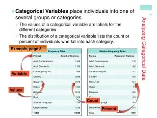
Frequency Table • A table that summarizes data for a single categorical variable is called a frequency table. • A frequency table can display raw counts, proportions, or both. • Examples for the variable number are below. raw count
Frequency Table • A table that summarizes data for a single categorical variable is called a frequency table. • A frequency table can display raw counts, proportions, or both. • Examples for the variable number are below. raw count proportion
Frequency Table • A table that summarizes data for a single categorical variable is called a frequency table. • A frequency table can display raw counts, proportions, or both. • Examples for the variable number are below. raw count both proportion
Bar plot A bar plot is a graphical representation of a frequency table. raw count proportion
The order of the bars There is often a natural ordering for the bars, such as by class year in the example below.
Changing the order of the bars When the bars are ordered from highest count to lowest count, it is sometimes called a Pareto chart.
Bar plot vs. pie chart Pie charts are another way to graphically represent a frequency table. They are well known, but generally not as useful as bar plots.
Categorical data pairs: contingency tables, side-by-side bar plots, segmented bar plots, and mosaic plots
Recall the data matrix for emails Rows 1, 2, 3, and 3921 of a data matrix are displayed below. It contains data collected on 3,921 emails that were received. Categorical variables
Pairing two categorical variables Rows 1, 2, 3, and 3921 of a data matrix are displayed below. It contains data collected on 3,921 emails that were received.
Contingency Table • A table that summarizes data for two categorical variables is called a contingency table.
Row and column proportions Row proportions are computed using row totals, and column proportions using column totals.
Example: long-term study on smoking A survey of 1,314 women in the United Kingdom during 1972-1974 asked each woman whether she was a smoker. Twenty years later, a follow-up survey observed whether each woman was dead or still alive. Below is a summary of the results.
Example: long-term study on smoking A survey of 1,314 women in the United Kingdom during 1972-1974 asked each woman whether she was a smoker. Twenty years later, a follow-up survey observed whether each woman was dead or still alive. Below is a summary of the results.
Example: long-term study on smoking A survey of 1,314 women in the United Kingdom during 1972-1974 asked each woman whether she was a smoker. Twenty years later, a follow-up survey observed whether each woman was dead or still alive. Below is a summary of the results.