Download
1 / 72
720 likes | 882 Vues
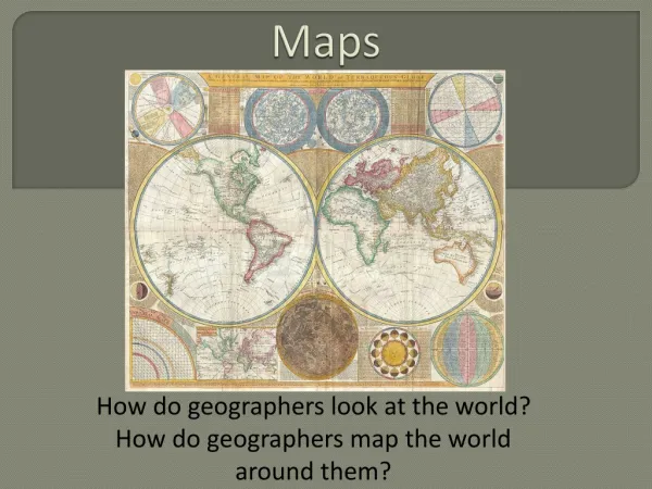
Destroying the ART in CARTOGRAPHY: Mapping DON’TS. by Dr. Miriam Helen Hill Jacksonville State University Jacksonville, Alabama. The purpose of mapmaking centers upon the communication of spatial patterns. . This is best done by maps that have been carefully planned and designed.

E N D
Destroying the ART in CARTOGRAPHY:Mapping DON’TS by Dr. Miriam Helen HillJacksonville State UniversityJacksonville, Alabama
The purpose of mapmaking centers upon the communication of spatial patterns. This is best done by maps that have been carefully planned and designed. Poor layout can destroy an otherwise high quality map product.
A choropleth map of the total number of registered automobiles illustrates errors in map layout and design. First, the basic map…..
The five map essentials for a good map are: TITLE LEGEND SCALE DIRECTION DATE
Generally, the title should be large, bold, and centered above the map. In particular cases, a title may be below the map. Usually this indicates the title is of little importance. In special design cases, the title may be to the left or to the right. This must be done carefully and cautiously.
The title should not be so large that it dwarfs or overpowers the map. While it needs to be dark and strong, an excess also can overpower the map.
The font of the title should be plain rather than fancy or decorative. The character must be appropriate for the map.
The title should tell WHAT WHERE and WHEN
The legend should be clear and detailed with distinct categories and symbols. An appropriate amount of generalization is needed.
The legend should give needed details about the symbols and be clearly and easily legible. It should describe what values are mapped and how these values were classified.
Conventional colors and symbols should be used. The legend should promote visual harmony and balance. White usually indicates a low value or no data.
The legend should be placed in an area where it will not interfere with the map.
The legend should be prominent but peripheral on the map page.
The scale should be given as a graphic scale, because reproduction will change the scale in the same order as it changes the map. The graphic scale should be properly designed to facilitate use. Verbal and RF scales, when given, should easily and clearly communicate to the map user.
The scale should have an appropriate boldness and not overpower the map.
Several graphic scales can be given, but care should be taken in design and placement. The design should be consistent. The scales should be grouped together.
The date of the data and the date of production should be provided. This is crucial information, because it identifies when the data represent and when the data were obtained.
Other essential information includes: credits for base map credits for data map projection cartographer identification
Credits should be sized to be legible but not overly prominent. The positions should be peripheral.
The choice of map projection is critical. When spatial distribution over the earth’s surface is an issue, an equal area projection must be used. Most projections do not maintain equal area relations.
The graticule or grid ticks should assist in location but not dominate.
Lettering guidelines state that the map should use: Only one typeface Several type families (as needed for differentiation) Between four to six different font sizes
Consider the audience, but avoid excessive and unnecessary labels
Blue lines may be invisible during photographic reproduction. All lines should be done with drawing instruments and guides with overlapping ends removed. The only freehand marks might be calligraphy which should use guidelines and planning to assist in consistent sizing and spacing of letters.
Two, three, or four different line weights are often desirable to help distinguish differences in line features. The widths need to be recognizable, but the total range must fit within comfortable viewing standards. Guides have been developed to help select appropriate line widths.