Crosstabs
170 likes | 292 Vues
This guide explores crosstab analysis in the context of political participation and corruption. It highlights the relationships between political alienation and participation, with a focus on the Resource Curse theory. By utilizing crosstabs to examine discretely measured variables and their interactions, we provide insights into how lucrative natural resources may influence corruption perceptions. Additionally, relevant Stata and R codes for data analysis are included, along with visualization techniques such as scatter plots. Understanding these dynamics is crucial for analyzing political systems and corruption dynamics.

Crosstabs
E N D
Presentation Transcript
Types of relationships • Linear • Spurious • Intervening • Interaction effects • Suppression
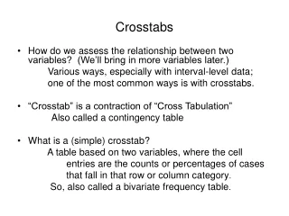
Crosstabs analysis Like a frequency table, it reports how many and what percentage fall into a particular category, but for two variables instead of one Not suitable for continuous variables; only for discretely measured variables It is sometimes useful to recode a variable with too many categories FOR THE PURPOSES OF ILLUSTRATION ONLY
Conventions the independent variable is arranged across the top of the table Percentages should be calculated using COLUMN Stata syntax: tabulate var1 var2
Is political participation caused by alienation from the political system? • Political participation – measured as number of activities and then collapsed 0-2 • Political alienation – measured as how ashamed of political system in Russia
Theory: Resource Curse • The presence of lucrative natural resources in country breeds corruption, as resources monies are diverted for personal gain. • Or, the presence of lucrative natural resources eases corruption, by keeping other monies from being diverted. • Measure: • Perceptions of Corruption (Transparency International)
Dependent variable: corruption • Gathered from questionnaires given to international businesspeople. • Low values indicate more corruption. • Scale from 1-10, 10 being least corrupt.
Measure of corruption Data=wbdata.dta, Stata code: histogram cpi2009score, freq
Corruption collapsed Corruption Freq. Percent Cum. Scores [1,2] 23 12.78 12.78 (2,3] 59 32.78 45.56 (3,4] 30 16.67 62.22 (4,5] 20 11.11 73.33 (5,6] 15 8.33 81.67 (6,7] 12 6.67 88.33 (7,8] 8 4.44 92.78 (8,9] 9 5 97.78 (9,10] 4 2.22 100 Total 180 100
Resource Curse Crosstab Analysis Resource Rents Corruption [1,11] (11,21] (21,31] (31,41] (41,51] (51,61] (61,71] Total [1,2] 11 4 1 0 1 0 0 17 (2,3] 19 4 5 2 0 1 1 32 (3,4] 12 1 2 0 1 1 0 17 (4,5] 9 2 2 0 0 0 0 13 (5,6] 7 0 1 0 0 0 0 8 (6,7] 5 0 0 2 0 0 0 7 (7,8] 3 0 1 0 1 0 0 5 (8,9] 2 0 0 0 0 0 0 2 (9,10] 2 0 0 0 0 0 0 2 Total 70 11 12 4 3 2 1 103
Corruption R code: (Use dataset wbdata.dta) library(foreign) myFile <- file.choose() dat <- read.dta(myFile,header=TRUE) attach(dat) plot(resrents, corrupt, xlab="Range of Percent of Expenditures from Resources", ylab="Range of Perceptions of Corruption", main="Corruption and Resources")
Data and crosstabs • Some useful notes: • Data=wbdata.dta • Stata code: tabulate corrupt resrents
Correlation information Stata syntax: pwcorr corrupt resrents, data=wbdata
Scatter plot R code: (Use dataset wbdata.dta) library(foreign) myFile <- file.choose() dat <- read.dta(myFile,header=TRUE) attach(dat) #Make Scatterplot scatterplot(cpi2009score~resourcerentspctofgdp, reg.line=lm, smooth=TRUE, spread=TRUE, boxplots='xy', span=0.5, data=dat)
Syntax for scatter plot Stata code: twoway (lfitci cpi2009score resourcerentspctofgdp) (scatter cpi2009score resourcerentspctofgdp) -Note: the scatter above is done in a different program, stata graphs will look slightly different.