Download
1 / 36
370 likes | 2.27k Vues
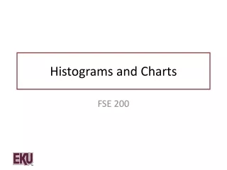
Assessing Student Understanding of Histograms and B ar Charts. Phyllis Curtiss, GVSU John Gabrosek, GVSU Jennifer Kaplan, UGA Chris Malone, WSU. Data. 341 Introduction to Applied Statistics students at Grand Valley State University Five different professors – 12 sections

E N D
Assessing Student Understanding of Histograms and Bar Charts Phyllis Curtiss, GVSU John Gabrosek, GVSU Jennifer Kaplan, UGA Chris Malone, WSU
Data • 341 Introduction to Applied Statistics students at Grand Valley State University • Five different professors – 12 sections • Collected first week and last week of class – Winter 2012 and Fall 2012 • Demographic survey • Knowledge of histograms
The Literature While there has been some research on student understanding of histograms, the literature contains specific calls for more work in this area. In particular, delMas, Garfield and Ooms (2005) “suggest that future studies examine ways to improve student understanding and reasoning about graphical representation of distribution, and in particular, of histograms.”
Five histograms are presented below. Each histogram displays test scores on a scale of 0 to 10 for one of five different statistics classes.
Which of the classes would you expect to have the lowest variability as measured by standard deviation? • Class A, because it has the most values close to the mean. • Class B, because it has the smallest number of distinct scores. • Class C, because there is no change in scores. • Class A and Class D, because they both have the smallest range. • Class E, because it looks the most normal.
Five histograms are presented below. Each histogram displays test scores on a scale of 0 to 10 for one of five different statistics classes.
Which of the classes would you expect to have the highest variability as measured by standard deviation? • Class A, because it has the largest difference between the heights of the bars. • Class B, because more of its scores are far from the mean. • Class C, because it has the largest number of different scores. • Class D, because the distribution is very bumpy and irregular. • Class E, because it has a large range and looks normal.
Which of the datasets depicted in the graph below would you expect to have the least variability as measured by the standard deviation, and why?
Which of the datasets depicted in the graph below would you expect to have the least variability as measured by the standard deviation? • Set A, because it has the most values away from the middle. • Set B, because it has the most values close to the middle. • Set C, because it is the most evenly (i.e. uniformly) spread out. • All three datasets would have the same standard deviation.
Misconception: A flatter histogram equates to less variability in the data.
The following histogram shows the Verbal SAT scores for 205 students entering a local college in the fall of 2002.
The median SAT-Verbal score for these 205 students is: • About 40 or 41 • Between 19 and 26 • Between 525 and 625 • Between 425 and 525
The following two graphs represent the amount of money spent on a pair of jeans, one for a sample of high school girls, and one for a sample of high school boys.
Which group has the larger mode? • Girls • Boys • The modes for the two graphs are roughly the same.
Misconception: Students use the frequency (y axis) instead of the data values (x axis) when reporting on the center of the distribution and the modal group of values.
The following graph shows the birthplace of students in a large introductory statistics course.
Circle the letter of your choice: • The median is Michigan. • The median cannot be told from the graph but could be if more information were given. • The median cannot be found for this information even if we had the birthplace for each individual student.
A baseball fan likes to keep track of statistics for the local high school baseball team. One of the statistics she recorded is the proportion of hits obtained by each player based on the number of times at bat as shown in the tables below.
Which of the following graphs gives the best display of the distribution of proportion of hits in that it allows the baseball fan to describe the shape, center and spread of the variable, proportion of hits? • 1 • 2 • 3 • 4
Which of the following graphs gives the best display of the distribution of proportion of hits in that it allows the baseball fan to describe the shape, center and spread of the variable, proportion of hits? • Choice 1 • Choice 2 • Choice 3 • Choice 4
Misconception: Students don’t understand the distinction between a bar chart and a histogram, and why this distinction is important.
The histogram below shows the Printing Cost (per week) for students at a nearby college.
This histogram suggests that students tend to spend the most on printing at the beginning of the semester. • False • True
If this college decided to increase drastically the amount students pay for printing, then the heights of the bars on this chart would get much taller. • False • True
There appears to be three times during the semester (beginning/middle/end) in which students spend a lot of money on printing at this college. • False • True
Misconception: For data that has an implied (though not collected) time component, students read the histogram as a time plot believing (incorrectly) that values on the left side of the graph took place earlier in time.