Making PowerPoint Slides
Making PowerPoint Slides. Avoiding the Pitfalls of Bad Slides. Tips to be Covered. Outlines Slide Structure Fonts Color Background Graphs Spelling and Grammar Conclusions Questions. Outline Formats are Easier to Follow. Outline . Make your 2 nd slide an outline of your presentation

Making PowerPoint Slides
E N D
Presentation Transcript
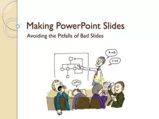
Making PowerPoint Slides Avoiding the Pitfalls of Bad Slides
Tips to be Covered • Outlines • Slide Structure • Fonts • Color • Background • Graphs • Spelling and Grammar • Conclusions • Questions
Outline • Make your 2nd slide an outline of your presentation • Ex: previous slide • Follow the order of your outline for the rest of the presentation • Only place main points on the outline slide • Ex: Use the titles of each slide as main points
Use the 6 X 6 rule: • 6 lines of text • 6 words per line
Use Bullets, Not Numbers • Bullets imply no significant order • Use numbers only to show rank or sequence
No More than One Topic per Slide What about them Sox hey?
Slide Structure – Good • Use 1-2 slides per minute of your presentation • Write in point form, not complete sentences • Include 4-5 points per slide • 6 * 6 Rule • 6 words per line • 6 lines per slide • Avoid wordiness: use key words and phrases only
Slide Structure - Bad • This page contains too many words for a presentation slide. It is not written in point form, making it difficult both for your audience to read and for you to present each point. Although there are exactly the same number of points on this slide as the previous slide, it looks much more complicated. In short, your audience will spend too much time trying to read this paragraph instead of listening to you.
Slide Structure – Good • Show one point at a time: • Will help audience concentrate on what you are saying • Will prevent audience from reading ahead • Will help you keep your presentation focused
Slide Structure - Bad • Do not use distracting animation • Do not go overboard with the animation • Be consistent with the animation that you use
Select Readable Type SizeThis is 40 point • Minimum 36 point for titles • 24 point for body text • This is 32 point 45 point 40 point 35 point 30 point 25 point 20 point 15 point 10 point
Use a Readable Typeface and Font • Use Sans serif (no curly feet) such as Arial or universal for body text • Use San serif (no curly feet) such as Arial or universal for body text • Use serif such as a roman for titles only Use a Readable Typeface and Font
Typeface Examples Typeface Examples • Typeface Examples • Typeface Examples • Typeface Examples • Typeface Examples • Arial • Times New Roman • CourierNew • GillSans
Adjust Lettering to discriminate or emphasize • Make titles a larger type size than body elements • emphasize important statements or words with bold, italic, larger size or different fonts.
Fonts - Good • Use at least a 24-point font • Use different size fonts for main points and secondary points • this font is 24-point, the main point font is 28-point, and the title font is 36-point • Use a standard font like Times New Roman or Arial • The bigger the better
Fonts - Bad • If you use a small font, your audience won’t be able to read what you have written • CAPITALIZE ONLY WHEN NECESSARY. IT IS DIFFICULT TO READ • Don’t use a complicated font
Color - Good • Use a color of font that contrasts sharply with the background • Ex: blue font on white background • Use color to reinforce the logic of your structure • Ex: light blue title and dark blue text • Use color to emphasize a point • But only use this occasionally
Color - Bad • Using a font color that does not contrast with the background color is hard to read • Using colour for decoration is distracting and annoying. • Using a different color for each point is unnecessary • Using a different color for secondary points is also unnecessary • Trying tobe creativecan alsobe bad
Choose Color Carefully • Use the same color consistently throughout the presentation • Use light letters on a dark background
To determine if a slide is legible when projected, hold it up to a light;if it is readable, it is probably fine
Colors • Avoid placing saturated primary colors (red, green or blue) adjacent to each other. • They may create a third color where the two colors meet.
Use Solid Colors instead of fill Patterns on Charts • Patterns on bars or pie slices cause confusion. • Solid colors convey a clear bold message
Background - Good • Use backgrounds such as this one that are attractive but simple • Use backgrounds which are light • Use the same background consistently throughout your presentation
Background – Bad • Avoid backgrounds that are distracting or difficult to read from • Always be consistent with the background that you use
Adjust Lettering to discriminate or emphasize • Make titles a larger type size than body elements • emphasize important statements or words with bold, italic, larger size or different fonts.
Graphs - Good • Use graphs rather than just charts and words • Data in graphs is easier to comprehend & retain than is raw data • Trends are easier to visualize in graph form • Always title your graphs
Graphs - Bad • Minor gridlines are unnecessary • Font is too small • Colours are illogical • Title is missing • Shading is distracting
Spelling and Grammar • Proof your slides for: • speling mistakes • the use of of repeated words • grammatical errors you might have make • Please have someone else check your presentation!
Conclusion • Use an effective and strong closing • Your audience is likely to remember your last words • Use a conclusion slide to: • Summarize the main points of your presentation • Suggest future avenues of research
Questions?? • End your presentation with a simple question slide to: • Invite your audience to ask questions • Provide a visual aid during question period • Avoid ending a presentation abruptly
Position Text • To move text box, drag the cursor over the box until a 4-point arrow appears. • Hold down the mouse button and drag. • To resize a text box, drag the cursor over the box until a 2-point arrow appears. • Hold down the mouse button and drag. • To set text, click outside text box.
Clipart • Add Clipart where appropriate • If ever
Insert Clip Art • Click Insert. • Select Picture. • Select Clip Art. • Choose an image. Click Insert. • Save.
Position Art • To move an image, drag the cursor over the image until a 4-point arrow appears. • Hold down the mouse button and drag. • To resize an image, drag the cursor over the image until a 2-point arrow appears. • Hold down the mouse button and drag. • Or click Format and select Picture to adjust image size, position, color, and line.
Create New Slide • Click Insert. Select New Slide. • Or click New Slide on Common Task bar. • Or click new slide icon on tool bar. • Choose the blank slide.
Animate Text • Insert text. Highlight text. • Click Slide Show. Select Custom Animation. • Choose desired effect options. • Choose desired timing options. • Click Preview. • Click OK. • Save.
Animate Clip Art • Insert Clip Art. • Click Slide Show. Select Custom Animation. • Choose desired effect options. • Choose desired timing options. • Click Preview. • Click OK. • Save.
Insert Transition Action • Click forward or backward arrow. • Click Slide Show. • Select Slide Transition. • Choose desired slide transition. • Click Apply to All. • Save.
Present Slide Show • Click Slide Show. • Select View Show. • Enjoy!
Your Slides are Not your Presentation • Your slides are a focus for your presentation • Your presentation is not proof of your thesis • Your paper is proof • You present your proof with slides to focus interest on what you think is important