Making PowerPoint Slides
Making PowerPoint Slides. Some tips to make your presentations more presentable. Tips to be Covered. Plan your presentation Outlines Slide Structure Appearance Capitalization Fonts Color Background Graphics Graphs Spelling and grammar Conclusions Questions.

Making PowerPoint Slides
E N D
Presentation Transcript
Making PowerPoint Slides Some tips to make your presentations more presentable
Tips to be Covered • Plan your presentation • Outlines • Slide Structure • Appearance • Capitalization • Fonts • Color • Background • Graphics • Graphs • Spelling and grammar • Conclusions • Questions
Planning the Presentation • Determine your purpose • Write a statement of purpose • Gather information • Think about WIIFY
Outline • Make your 1st or 2nd slide an outline of your presentation • Follow the order of your outline for the rest of the presentation • Only place main points on the outline slide • Ex: Use the titles of each slide as main points
Slide Structure – What to do • Use 1-2 slides per minute of your presentation • Write in point form with bullets, not complete sentences • Include 4-5 points per slide – no more than 6 • Avoid wordiness: use key words and phrases only 6 or 7 words per point
Slide Structure –too wordy • This page contains too many words for a presentation slide. It is not written in point form, making it difficult both for your audience to read and for you to present each point. Although there are exactly the same number of points on this slide as the previous slide, it looks much more complicated. In short, your audience will spend too much time trying to read this paragraph instead of listening to you.
Slide Structure – What to do • Show one point at a time: • Will help audience concentrate on what you are saying • Will prevent audience from reading ahead • Will help you keep your presentation focused
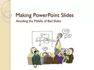
Slide Structure What NOT to do • Do not use distracting animation Donot go overboard with the animation Be consistent with the animation that you use
Basic rules for appearance Keep it simple.. • Make bulleted points easy to read. Do not center. • Keep text easy to understand. • Use concise wording. • Bullets are focal points. • Presenter provides elaboration. • Keep font size large.
Basic Rules- capitalization AVOID ALL CAPS – VERY HARD TO READ. • First Cap - More Formal. • Harder To Type And More Decisions. • First word cap. • Less formal. • Easier to type and fewer decisions.
Fonts – What to do • Use at least an 18-point font • Use different size fonts for main points and secondary points • this font is 22-point and the title font is 40-point • Use bold when you want some words to stand out. • Use a standard font like Times New Roman (serif) or Arial (sans serif)
Fonts – What NOT to do • If you use a small font, your audience won’t be able to read what you have written • Italics are more difficult to read. • CAPITALIZE ONLY WHEN NECESSARY. IT IS DIFFICULT TO READ • Don’t use a complicated font
Color – Contrast is important • Use a color of font that contrasts sharply with the background • Ex: blue font on white background • Use color to reinforce the logic of your structure • Ex: light blue title and dark blue text • Use color to emphasize a point • But only use this occasionally
Color – Over used • Using a font color that does not contrast with the background color is hard to read • Using color for decoration is distracting and annoying. • Using a different color for each point is unnecessary • Using a different color for secondary points is also unnecessary • Trying tobe creativecan alsobe bad
Background – Easy to look at • Use backgrounds such as this one that are attractive but simple • Use backgrounds which are light • Use the same background consistently throughout your presentation
Background – Too difficult to look at • Avoid backgrounds that are distracting or difficult to read from • Always be consistent with the background that you use
Basic Rules for graphics Place graphics off-center. Balance. • More room for text. Better balance. More pleasing to the eye. Left placement leads the eye to the text.
Clip art & graphics • A few excellent graphics are better than many poor ones. • Photographs can be powerful. • Use sparingly!
Martin Luther King Jr. Religious leader Civil rights activist Author/poet Labor activist Minister Antiwar activist
Martin Luther King Jr. Religious leader Civil rights activist Author/poet Labor activist Minister Antiwar activist
Graphs • Use graphs rather than just charts and words • Data in graphs is easier to comprehend & retain than is raw data • Trends are easier to visualize in graph form • Always title your graphs
What is wrong with this graph? • Minor gridlines are unnecessary • Font is too small • Colors are illogical • Title is missing • Shading is distracting
Spelling and Grammar • Proof your slides for: • speling mistakes • the use of of repeated words • grammatical errors you might have make • If English is not your first language, please have someone else check your presentation!
Conclusion • Use an effective and strong closing • Your audience is likely to remember your last words • Use a conclusion slide to: • Summarize the main points of your presentation • Suggest future avenues of research
WIIFY Important to you because What does this mean to you? Why am I telling you this? Who cares? So what? And … here’s the WIIFY Source: Jerry Weismann – Presenting to Win
Questions?? • End your presentation with a simple question slide to: • Invite your audience to ask questions • Provide a visual aid during question period • Avoid ending a presentation abruptly