Making PowerPoint Slides
Making PowerPoint Slides. Avoiding the Pitfalls of Bad Slides. Oral Presentations. PowerPoint lectures and presentations. Poster presentations What makes a good poster. How to present a poster. Outline. • Preparing your presentation – Communicating your message effectively

Making PowerPoint Slides
E N D
Presentation Transcript
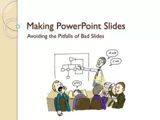
Making PowerPoint Slides Avoiding the Pitfalls of Bad Slides
Oral Presentations • PowerPoint lectures and presentations. • Poster presentations • What makes a good poster. • How to present a poster.
Outline • Preparing your presentation – Communicating your message effectively • Preparing good quality slides – Pitfalls –tips to maximize usefulness • Presenting your talk
Outlines Slide Structure Fonts Colour Background Graphs Spelling and Grammar Conclusions Questions Tips to be Covered
Prepare your talk in this order: • 1. Your objective • 2. Key points with supporting material and transitions • 3. Preview and summary • 4. Opener • 5. Closing
Present your talk in this order: • Introduction Opener • Objective • Preview • Body of talk: • Key Point 1 • Supporting material • Transition • Key Point 2 • Supporting material • Transition • Key Point 3 • Supporting material • Closing • Summary • Acknowledgements –
Outline • Make your 1st or 2nd slide an outline of your presentation • Ex: previous slide • Follow the order of your outline for the rest of the presentation • Only place main points on the outline slide • Ex: Use the titles of each slide as main points
Slide Structure – Good • Use 1-2 slides per minute of your presentation • Write in point form, not complete sentences • Include 4-5 points per slide • Avoid wordiness: use key words and phrases only
Slide Structure - Bad • This page contains too many words for a presentation slide. It is not written in point form, making it difficult both for your audience to read and for you to present each point. Although there are exactly the same number of points on this slide as the previous slide, it looks much more complicated. In short, your audience will spend too much time trying to read this paragraph instead of listening to you.
Slide Structure – Good • Show one point at a time: • Will help audience concentrate on what you are saying • Will prevent audience from reading ahead • Will help you keep your presentation focused
Slide Structure - Bad • Do not use distracting animation • Do not go overboard with the animation • Be consistent with the animation that you use
Fonts - Good • Use at least an 18-point font • Use different size fonts for main points and secondary points • this font is 24-point, the main point font is 28-point, and the title font is 36-point • Use a standard font like Times New Roman or Arial
Fonts - Bad • If you use a small font, your audience won’t be able to read what you have written • CAPITALIZE ONLY WHEN NECESSARY. IT IS DIFFICULT TO READ • Don’t use a complicated font
Colour - Good • Use a colour of font that contrasts sharply with the background • Ex: blue font on white background • Use colour to reinforce the logic of your structure • Ex: light blue title and dark blue text • Use colour to emphasize a point • But only use this occasionally
Colour - Bad • Using a font colour that does not contrast with the background colour is hard to read • Using colour for decoration is distracting and annoying. • Using a different colour for each point is unnecessary • Using a different colour for secondary points is also unnecessary • Trying tobe creativecan alsobe bad
Background - Good • Use backgrounds such as this one that are attractive but simple • Use backgrounds which are light • Use the same background consistently throughout your presentation
Background – Bad • Avoid backgrounds that are distracting or difficult to read from • Always be consistent with the background that you use
Graphs - Good • Use graphs rather than just charts and words • Data in graphs is easier to comprehend & retain than is raw data • Trends are easier to visualize in graph form • Always title your graphs
Graphs - Bad • Minor gridlines are unnecessary • Font is too small • Colours are illogical • Title is missing • Shading is distracting
Spelling and Grammar • Proof your slides for: • speling mistakes • the use of of repeated words • grammatical errors you might have make • If English is not your first language, please have someone else check your presentation!
Make It Clear (Numbers) Use numbers for lists with sequence For example: How to put an elephant into a fridge? 1. Open the door of the fridge 2. Put the elephant in 3. Close the door
Make It Clear (Numbers) How to put a giraffe into a fridge? 1. Open the door of the fridge 2. Take out the elephant 3. Put the giraffe in 4. Close the door
Make It Clear (Contrast) • Use contrasting colours • Light on dark vs dark on light • Use complementary colours • This is light on dark
Make It Clear (Contrast) • Use contrasting colours • Light on dark vs dark on light • Use complementary colours • This is dark on light
Make It Clear (Complement) • Use contrasting colours • Light on dark vs dark on light • Use complementary colours • These colours do not complement
Make It Clear (Complement) • Use contrasting colours • Light on dark vs dark on light • Use complementary colours • These colours complement
Conclusion • Use an effective and strong closing • Your audience is likely to remember your last words • Use a conclusion slide to: • Summarize the main points of your presentation • Suggest future avenues of research
Questions?? • End your presentation with a simple question slide to: • Invite your audience to ask questions • Provide a visual aid during question period • Avoid ending a presentation abruptly
PowerPoint Presentation Guidelines • 1.Speak to your audience before launching your visuals. • 2.Keep eye contact primarily with your audience, not with your visual aids. • 3.Avoid reading your slides or overheads to your audience. • 4.Keep text to a minimum; let images and graphics illustrate and dramatize your points. • 5.Use a font style that is simple and large enough • styles at least 18-24 points) to be read at a distance. No strange fonts
PowerPoint Presentation Guidelines • 6.Minimize the number of points per slide. • 7.Ensure consistency of syntax on each slide (e.g., if the first bullet point starts with a verb, all subsequent bullet points should start with a verb-it's easier to comprehend and more powerful). • 8.Take time to introduce - and pause to allow the audience time to absorb - any - complex information (e.g., from a graph or chart). • 9.Put your slide titles to work: help deliver the message, not merely give a name to the slide. • 10.Blank the Screen to focus attention and re-claim the spotlight. (press b key to blank screen)
Posters • The fewer the words, the better the poster. • The perfect poster is like the card in the pocket in front of you on an airplane; the one that tells you how to get off the plane without using a single word. • Assume at the outset that you have too many words, and too small a font on your draft poster. • Assume at the outset that no one is going to read your poster, but they may stop by and talk to you about it, if it looks easy to understand and visually attractive.
Posters (cont.) Use a block layout; do not let sections flow into each other. Use few fonts and font styles. Limit the citations. People don’t need to see in a poster citations to all the background literature. Include contact info for yourself. Consider: • giving out a small printed version. • including a picture of yourself in the corner. Most of all, use as few words as possible.
Manning a poster • Don’t just stand there; offer to explain the poster to any passersby who lingers long enough to start reading the Abstract or Conclusions. • Make it a conversation, not a canned performance. Ask the viewers about their own research interests. Give them time to ask questions. Make sure they are following you. Make sure you can present the whole thing in about six minutes. • Have cards or sheets with your contact info to hand out to anyone who would like additional information.
Other topics for consideration? • ?????????????????????