Making PowerPoint Slides
Learn how to structure slides, choose fonts and colors, use graphs effectively, and avoid common mistakes in PowerPoint presentations. Find tips for conveying your message confidently and engaging your audience through body language. Prepare for a successful presentation by following these guidelines.

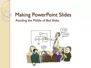
Making PowerPoint Slides
E N D
Presentation Transcript
Making PowerPoint Slides Adopted from Mary Westervelt, University of Pennsylvania
General pointers Outlines Slide Structure Fonts Color Background Graphs Spelling and Grammar Conclusions Questions Tips to be Covered 2
Convey the message! Five points for effective body language: • Face the audience. • Make eye contact. Don’t simply read off from the slides • Move! But not too much. • Use gestures that convey the message. • Thank the audience when they offer a suggestion or an idea.
Nerves complicate things Most important: • Take time to prepare. • Plan how to hand off between group members. • Practice - with a critical audience. • Check the room before hand to make sure the equipment works
Ppt = vehicle; You = driver! Don’t • Read slides • Use complex slides • Use unintelligible slides • Use irrelevant or distracting slides • Rush through slides • Blank out in the middle of the talk
Outline • Make your 1st or 2nd slide an outline of your presentation • Ex: previous slide • Follow the order of your outline for the rest of the presentation • Only place main points on the outline slide • Ex: Use the titles of each slide as main points 6
Slide Structure – Good • Use one slide per minute or two of your presentation • Write in point or bullet form, not complete sentences • Include 4-5 points per slide • Avoid wordiness: use key words and phrases only 7
Slide Structure - Bad • This page contains too many words for a presentation slide. It is not written in point form, making it difficult both for your audience to read and for you to present each point. Although there are exactly the same number of points on this slide as the previous slide, it looks much more complicated. In short, your audience will spend too much time trying to read this paragraph instead of listening to you. 8
Slide Structure – Good • This is an example of a good slide: • Ideas are presented in point format • It is not too wordy • Complete and long sentences are avoided 9
Slide Structure - Bad • Do not use distracting animation • Do not go overboard with the animation • Be consistent with the animation that you use 10
Fonts - Good • Use at least an 18-point font • Use different size fonts for main points and secondary points • this font is 24-point, the main point font is 28-point, and the title font is 36-point • Use a standard font like Times New Roman or Arial 11
Fonts - Bad • If you use a small font, your audience won’t be able to read what you have written • CAPITALIZE ONLY WHEN NECESSARY. IT IS DIFFICULT TO READ • Don’t use a complicated font 12
Color - Good • Use a color of font that contrasts sharply with the background • Ex: blue font on white background • Use color to reinforce the logic of your structure • Ex: light blue title and dark blue text • Use color to emphasize a point • But only use this occasionally 13
Color - Bad • Using a font color that does not contrast with the background color is hard to read • Using color for decoration is distracting and annoying. • Using a different color for each point is unnecessary • Using a different color for secondary points is also unnecessary • Trying tobe creativecan alsobe bad 14
Background - Good • Use backgrounds such as this one that are attractive but simple. • Using plain backgrounds without any color is alos good. • Use backgrounds which are light • Dark is arty, but hard on the eyes • Dark is expensive to reproduce on paper (for handouts) • Use the same background consistently throughout your presentation 15
Background – Bad • Avoid backgrounds that are distracting or difficult to read from • Always be consistent with the background that you use
Graphs - Good • Use graphs rather than just charts and words. • Data in graphs is easier to comprehend & retain than is raw data • Trends are easier to visualize in graph form • Always title your graphs. • Label the axis including units. • Always give credit to the source. 17
Graphs - Good Include text below the graph (like this) summarizing the main things you observe 18
Graphs - Bad 19
Graphs - Bad • Minor gridlines are unnecessary • Font is too small • Colors are illogical • Title is missing • Shading is distracting 20
Spelling and Grammar • Proof your slides for: • speling mistakes • the use of of repeated words • grammatical errors you might have make 21
Conclusion • Use an effective and strong closing • Your audience is likely to remember your last words • Use a conclusion slide to • Summarize the main points of your presentation • Suggest future avenues of research 22
Five final suggestions for slide presentations • Number slides • Keep font large and dark • Include a guide showing where you are in the talk • Have a backup plan (Handouts, Chalk talk) • Be prepared for questions • Prepare answers • Prepare backup slides to use only when needed
Questions?? • End your presentation with a simple question slide to: • Invite your audience to ask questions • Provide a visual aid during question period • Avoid ending a presentation abruptly 24