The 7 Basic Quality Tools
The 7 Basic Quality Tools. Michele Cano. Agenda. Introductions Basic Tools – Ishikawa Exercises Discussion & Video ………………….Lunch………………………. Problem solving (Global 8D and TRIZ) Case study Discussion . Why use tools?. Measure Improve. What are they?.


The 7 Basic Quality Tools
E N D
Presentation Transcript
The 7 Basic Quality Tools Michele Cano
Agenda • Introductions • Basic Tools – Ishikawa • Exercises • Discussion & Video ………………….Lunch………………………. • Problem solving (Global 8D and TRIZ) • Case study • Discussion
Why use tools? • Measure • Improve
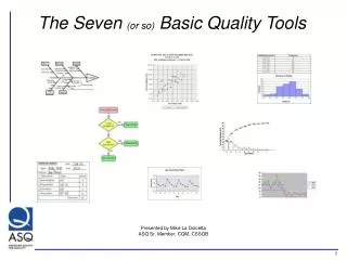
What are they? The seven basic tools according to Ishikawa are: • Check sheets • Flow charts • Graphs & Histograms • Pareto diagram • Cause and effect diagram • Scatter diagram • Control chart
1.Check sheets • What is a check sheet? • A form or sheet used to record data.
Function of Check Sheets According to Ishikawa 1982, check sheets have the following functions: • Production Process distribution checks • Defective item checks • Defective location checks • Defective cause checks • Check-up confirmation checks • Others
FlowchartsPROCESS MAPPING • Process mapping is an essential first step. • It identifies all of the process activities, sequence and responsibilities. • This can either be in a written format, or as a flowchart.
Flowcharting • Flowcharting is a graphical tool for analysing processes. • Constructing flowcharts leads to a better understanding of processes. • Better understanding of processes is a essential for improvement
Exercise Draw a flowchart for one of the following processes: • Making a cup of coffee • Enrolling students • Wiring a plug.
3. Graphs & Histograms Graphs, either presentational or mathematical are used to allow understanding and analysis of collected data sets.
GraphsBAR CHARTS • This is the data set totalled up and shown graphically. • It immediately identifies the major defects for all to see.
Graphs • The below graph shows a factory output for February. This time it shows specific dates which could be analysed.
Graphs • The graph below shows the major cause for customer complaint, the use of the pie chart and the colours enforce the message.
Rules for Graphing • Use Clear titles an indicate when the data was collected • Ensure the scales are clear, understandable and represent the data accurately. • When possible use symbols for extra data. • Always keep in mind the reason why the graph is being used.
Exercise Graphs • You are the marketing director of XZY automotive, a new Scottish company. You have organised a local survey to rate your car against other small cars. • 30 people were polled and the results are shown below. • Xzy, ka, Clio, Clio, ka, fiesta, xzy, ka, 206, xzy, fiesta, fiesta, xzy, polo, fiesta, 206, 206, polo, 206, fiesta, fiesta, fiesta, polo, xzy, polo, fiesta, xzy, xzy, ka, xzy. • You recognise the power that graphs produce. And you have decided to Graph the results as part of you marketing drive. Explain your choice of graph.
What is a Histogram? • The Histogram is a graphical representation of data that is a dimensional measurement of one feature.
What is a Histogram? • This is the computer defect data set totalled up and shown graphically, but is it a histogram?
What is a Histogram? • The answer to the previous question is NO • The Histogram is a graphical representation of data that, is a dimensional measurement of one feature.
When is a Histogram Used? • To look at one particular set of results • To check for patterns in a process • To examine large amounts of data
Histograms • The following data was collected when measuring the bow (warp) of a plastic component. The specification is 0 to 8 x10⁻³ mm. • At a glance this tells you very little, but it can be plotted as a histogram because we have quantities data with target limits.
6 5 4 3 Frequency 2 1 0 6 9 0 1 2 3 4 5 7 8 More Thou Histograms
What is a Histogram? Exercise • Sort the following data into appropriate sets, then plot them. • The limits are 3 volts ± 0.1 • What can you deduce from this?
What is a Histogram? Exercise
ParetoWhat is Pareto Analysis? • Pareto analysis is a method for prioritising data. • It consists of a Bar Chart displayed either in order of frequency or relative cost.
Houshold repairs over the last 10 years Cost £ per Total cost Problem frequency occurance £ Light bulb fails 100 0.6 60 Broken central heating pump 1 190 190 Broken window 2 50 100 Leaking taps 16 2.5 40 Faulty central heating boiler 1 3000 3000 Leaking radiators 3 15 45 ParetoExample: The information to be represented on a Pareto diagram should already have been collected in some sort of record.
ParetoPareto Chart The data are then displayed graphically. Firstly in terms of frequency.....
Pareto ... and then by cost.
6. Cause and Effect Diagrams (Ishikawa) A method for the identification of the root cause of a problem.
cause and effectWhat is Brainstorming? • A way to get creative ideas. • A way to get everyone’s views. • A way to generate alternatives.
cause and effectPotential Uses (Brainstorming) • For identifying areas for improvement. • For finding potential causes of problems. • For developing possible preventive actions.
Give wild and unusual ideas. Aim for quantity. Build on ideas of others. Encourage participation. Evaluate or criticise. Stop to soon. Allow domination or idea ownership. cause and effectSome Guidelines (Brainstorming) Do’s Don'ts
cause and effectRanking Ranking can be used after brainstorming to assess the teams Priority position on a list of ideas. The basic procedure is: • Each person privately selects 3 to 5 items from the list • Each person ranks their selection in order of priority • The marks are then totalled for each item • The item having the highest total is then judged to have the • highest priority
cause and effectWhat is a Cause and Effect Diagram? • The process of a cause and effect diagram consists of defining an effect in terms of possible causes and is normally carried out in the form of a Brainstorming session. • The principal causes are typically Man, Materials, Methods or Machines. • These are then reduced to sub-causes. • Finally, the most likely causes are then circled and are subject to future examination. • These relationships are displayed pictorially in the form of a fishbone structure.
cause and effectLayout: Method Man Sub-Cause Sub-Cause Sub-Cause Effect Sub-Cause Sub-Cause Sub-Cause Materials Machines
6. Scatter Diagrams A method for the identification the relationship (effect) between two factors (Causes).
Scatter diagramsWhat is it used for? • Validating "hunches" about a cause-and-effect relationship between two variables. • Displaying the direction of the relationship (positive, negative, etc.) • Displaying the strength of the relationship
Scatter diagramsConstructing scatter diagram • In order to construct a scatter diagram you need two variables to be plotted against each other. One on the x axis the other on the y axis. • The relationship is then plotted. Variable b relationship Variable a
Scatter diagramsConstructing scatter diagram • This process is continued, showing the effect of changes in one of the variables against the other variable. Variable b Variable a
Scatter diagramsInterpreting a scatter diagram • The diagram below shows a Strong Positive relationship between the variables (an in crease in a results in a positive increase in b, which is almost uniform.) Variable b Variable a
Scatter diagramsInterpreting a scatter diagram • The diagram below shows a Strong Negative relationship between the variables (an in crease in a results in a decrease in b, which is almost uniform.) Variable b Variable a
Scatter diagramsInterpreting a scatter diagram • The diagram below shows a Weak Positive relationship between the variables. Variable b Variable a
Scatter diagramsInterpreting a scatter diagram • The diagram below shows a Weak Negative relationship between the variables. Variable b Variable a
Scatter diagramsInterpreting a scatter diagram • The diagram below shows a that there is no relationship between the variables. Variable b Variable a