Download
1 / 13
130 likes | 260 Vues
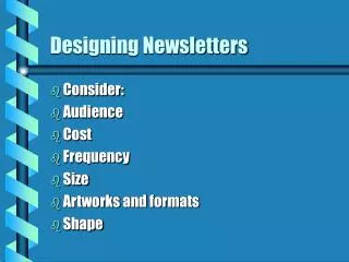
Designing Newsletters. Consider: Audience Cost Frequency Size Artworks and formats Shape. Audience. Who are they What about demographics - how do they relate to the audience and its needs Is it a technical audience/newsletter - how would this impact on design?

E N D
Designing Newsletters • Consider: • Audience • Cost • Frequency • Size • Artworks and formats • Shape
Audience • Who are they • What about demographics - how do they relate to the audience and its needs • Is it a technical audience/newsletter - how would this impact on design? • Is it an audience of creative/artistic people - how would this impact on design?
Shape • Does the newsletter and requirements lend itself to a specific shape? • What shapes might work well - full A4 or A5 or tabloid size • What about the shapes within the pages - eg design freeform or modular?
Freqeuncy • Smaller size and pages for more frequent newsletters • Larger size and pages for less frequent newsletters
Designing Newsletters (2) • Design is significant element of newsletter • Should not overwhelm copy but help it
Basic Rules • Balance - white space, blocks of text, shapes of graphics, all elements in harmony • Proportion: are elements in correct proportions to page, each other, other elements • Sequence - the flow of elements
Basic Rules • Emphasis - where are focal points, which elements grab attention, what do you look at first • Unity - how does the entire page, and how do the pages, fit together; how do elements link to each other? Relationship of elements to each other
Basic Designs • Modular: using squares, rectangles to design within - good for text • Freeform: less structured, not always good for lots of text
Basic Considerations/elements • Masthead • - reflect newsletter • - appeal to readers • - tie to organisation • - name • - date and issue • - logo • Footers and Headers
Basic considerations • Typographic Stuff • - complementary headline and body copy fonts • - size to suit audience • - one/two for headlines • - vary headlines size and boldness
Basic considerations • Allocate stories • - page one, most important story and best pic • - right hand pages important stories • Graphics and photos • - use effectively • - same modules
Basic Considerations • Columns - reflective of type of content • Page one the most important story and your best photo or graphic • Pages three five and seven, have important stories eg page 3 more important than five and five more so than seven. • Pages 2,4,6,8 are reserved for less important information - as people are supposed to read right hand pages before left hand ones.
Basic considerations • Graphics and photos need to be handled carefully, they must relate to the copy but add to the story it tells. • Make sure your graphics and photos are placed in the same module as the story they relate to , don't put a story one page one and its photo on page four.