WEB SITE CHANGES TOM CLARK
This communication addresses the recent website downtime due to security and compliance issues. We sincerely apologize for any confusion caused and appreciate the dedicated efforts from our design team: Lisa Carlsen, Danielle Maze, Scott Hildreth, Catherine Powell, Ramona Silver, Laura Alacron, Tim Dave, Lani Wilson, Jon Palacio, and Wayne Phillips. Moving forward, we aim to enhance our website's structure, content, and user experience to ensure it meets the needs of prospective students and the community. Resources for further information are available on our dedicated policy link.

WEB SITE CHANGES TOM CLARK
E N D
Presentation Transcript
WEB SITE CHANGESTOM CLARK MY APOLOGY FOR THE CONFUSION
Thanks To The Following Folks Who Helped With The Design over the Summer:Lisa Carlsen, Danielle Maze, Scott Hildreth, Catherine Powell, Ramona SilverLaura Alacron, Tim Dave, Lani Wilson, Jon Palacio, and Wayne Phillips
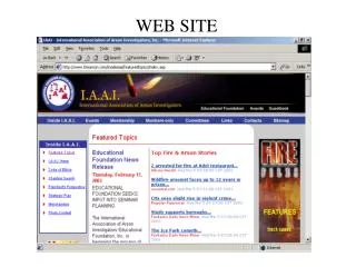
I had to take the website down because the site was compromised and failed to meet some state and safety guidelines
Resources for more information about web specifics include:Tom Clark, as more information is gathered, orJeannine Menthe, CTOPolicies and Procedures Documented at:http://www.clpccd.org/tech/TechnologyStandardsPolicies.php
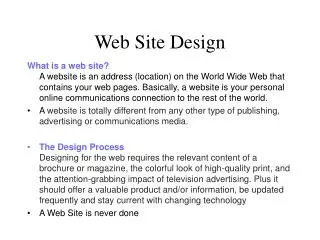
Three-page Condensed Interact Communications Plan (ICP) Information used in 2.0 & 3.0 DesignSelected Interact Communications QuotesIntroductionHas little or no marketing or outreach capabilities. In fact, there is very little content at all which is addressed to the viewer. Rather, part of the clarity of the site is due to its lack of user focused content.There is no clear path for the new student or interested community member to explore what the college has to offer. Instead the assumption is that the visitor knows that they need a schedule of classes, and that they must apply and register.The site is primarily focused on meeting information needs for current students and faculty and staff. What it is not is a website that explains t visitors the many ways in which Chabot College can play a role in their life. Prospective students are not addressed directly, and neither is there recognition of the different informational needs of traditional versus non traditional students.It is a solid site if you are an insider. It is a maze if you are on the outside of the organization looking in.Perhaps the most obvious gap is marketing language. There is nothing that speaks to a high school student or their parents…..nothing that speaks to a working adult….to business….nothing that reminds the community that Chabot is an important part of the social life …Structure and DesignHome page is a solid sorting page, but has very little content, 90% of the information is not of interest to groups or individuals outside the collegeCore information is too deep and assumes you are an internal individualRecruitment FunctionThere are 15 bullet items that point out major weaknesses (Note: District CLASS-Web adds to confusion and detracts from the ability to short-cut navigation) RecommendationsCreate a “pod” for perspective high school students with information on why choose Chabot, why a community college, unique programs, connections with current students, unique faculty, and alumni who are successfulAllow for text messaging contact (rather than simply face-to-face and phone)Remove all information from that pod that is focused on other audiences (business, community, etc.)Consider creating a parents area or a high school guidance counselor area in the high school podCreate this area with graphics, photos, and small flash areas that do not damage the 508 compliance of the siteRetention FunctionSeven bulleted items point out a lack of student “social” content and meaningful presentation of information in non-academic jargon RecommendationsCreate a “pod” for current students with information from student publicationsProvide an area where students can manage their own contentConsider a student blog with information on events for students by studentsWork to create a sense of commitment to Chabot while students are there (rather than waiting until they are alumni)Infuse communications in this area with a sense of fun and emotional richnessConsider providing an area for student portfolios or areas where students can post their own materialsGive student life a prominent role in the student areaAllow areas where current student successes can be promotedCreate a focus on services that encourage students to stay in school (short term loans, tutors, etc.)
Design ParametersLast Four pages discuss design parameters and focus on how distinct users need different designs and presentation of information. Provides core information that should be on each page and makes key recommendations for interactivity.Interactivity RecommendationsAll groups:Searchable data bases faculty and staff information, catalog (programs), and classesEmail addresses, forms, PDF downloads, powerful search engine, downloadable forms (Word)High School & Current Students: Live chat (instant messaging), video streamingBusiness: Searchable data bases of business services, downloadable formsOverall FindingsWebsite is an internally focused toolAs a recruitment tool it is ineffective as external audiences are almost an afterthought.There is no persuasive messaging in the site. It is a “Dragnet” site (Just the facts, ma’am)Core content is too deep within the site, typically requiring three clicks to arrive at any real information.The list structure is very effective for faculty and staff but less so for all other users. There is no easily accessed community information that reminds the public of the role Chabot College plays in the community.There is no distinction in the types of prospective students the college might attract (traditional, non-traditional, professional development, lifelong learning, economic development)There is no content, structure, or design aimed at creating a sense of community among current studentsThe site is consistent and does not send users offsite to a non-brand focused URL.There are no color cues within the website to indicate you are in a different section. This makes it easy to become disoriented and lose your way.There are few email links and this site assumes that users will want to call rather than emailThere are numerous broken links to important individuals at top levels of the site. (VP)The site functions as a online catalog with important “contact information” but no depth or human elements.There is nothing on the site that would allow a member of the community to emotionally connect with Chabot.
Overall RecommendationsImplement a content management system that allows for the development of marketing information.Refocus the website on its marketing (recruitment) functionsRemove the externally focused and student information from the website, and make it the current website for faculty and staff.Immediately implement a new high school student pod, a new community pod (which serves the general community and working adults), and a new current student pod.Develop new content for each of these areas and implement the navigational structure suggested in this reportDevelop a comprehensive design for these pods that creates the Chabot College brand but has graphics, functions, and interactivity levels appropriate for each group.Consider sub-pods that allow for an athletics area and a performing arts areaRealign the web management function so that the content development and management functions report to marketing (Note: Tried this for a year)Redesign the external pods so that they are more graphical, with photos that are representative of the target audiencesCreate cookie trails to aid in navigation, and consider using color cues to signal the podsImplement parallel web structures for external pods (High school students and community pods) between Chabot and LPC so that the community can easily navigate both.Allow the internal pods (current students and faculty and staff) to have unique content that represents the internal functions and organizational structure of each collegeSelected data from CLARUS marketing reportPreferred Information Sources Web Site (93%)Course Descriptions (88%)Campus Visits (87%)College Catalog (79%)College Information Nights (78%)Class Schedule (78%)College Guides (75%)Go To Web Site (50%)42% Chabot Region And 58% Las Positas RegionMyPage Development On Colleges’Web Sites95% Have Internet AccessOnline 32 Hours Per Week (Average)Surf For Information (90%)School Research (89%)Send E-Mails (77%)Instant Message With Friends (73%)Download Music (62%)Play Online Games (37%)Shop Online (31%)Take Classes (13%)