Download
1 / 5
50 likes | 211 Vues
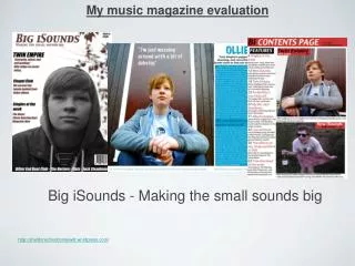
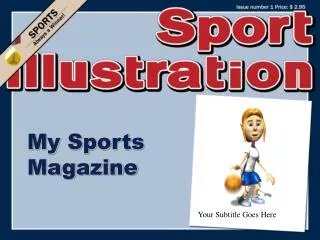
My Magazine. Evaluation. Front Cover. For my magazine front cover I decided to use a mid shot. I chose not to have the artist models body facing away form the camera but to have him facing it to represent the arrogant nature of rappers almost making it seem that he not bother with the picture.

E N D
My Magazine Evaluation
Front Cover For my magazine front cover I decided to use a mid shot. I chose not to have the artist models body facing away form the camera but to have him facing it to represent the arrogant nature of rappers almost making it seem that he not bother with the picture. I changed the background to represent the jungle and got the model to were green to show this furthermore and also as representation as the jungle them represents the models background. I came up with the name The Proclaimer as this magazine will be proclaiming the latest rap goings on. I chose to have the writing font colour scheme match the colour scheme of the background. I also chose the to use the font comic book as this artist thinks of him self as a superhero.
Contents Page For my contents page I decided to keep it simple and decided to use conventions seen in other magazines. I decided to not have to much text on the page as this may discouraged readers. I stuck to a very basic colour seem which is shown through out my magazine. Under each heading of a article name I gave a brief description of what is in the section. I made the main article story stand out but putting a large image of the artist and by putting the information on there article in red so that it stands out on the page. I also chose to use images to represent articles and put my sell line and date on the page.
Double Page Spread For my double page spread I chose to used to pictures of the artist on the page instead of one to represent the vanity of many rappers. I made one image large which represents the big ego that most rappers have and to add on to this got the model to have a smug look on there face and got the artist name to be the largest writing on the page. On this page I edited the models t-shirt to be brighter and stand out more on the page. My article starts off with a introduction and then goes on to Q and A. I stuck with the same colour scheme of grey and used conventions shown in other magazine. I made sure that the first letter of the article was bigger that the rest. I also insured to have the magazine name on the dps and the date. I also used a pulled out quoatition and made it stand out by making it green.
Production When making my magazine cover I first decided to use publisher but found that your editing capability was edited compared to Photoshop and decide to use Photoshop which I believe was wise decision as without it a lot of the images on my magazine wouldn’t have been edited to such a high quality. While creating and planning my magazine I had to keep in mind the whole time the age of my target audience which was 15 – 30. To make my magazine appeal to this age group further more I decided to use a model which was in between my target age group and had to make sure that the language used in my magazine was appropriate as were the images.