
TITLES
E N D
Presentation Transcript
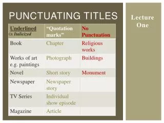
TITLES There are countless different combinations of fonts, colours, styles and techniques that can be used to incorporate titles into a film trailer. However there are some ways that are unsuitable for either certain genres of demographics for example for the next Toy Story film you would not have the words caked in blood. Similarly you would not have the font for the next big horror film made out of fluffy clouds. For this reason the film trailers I will analysis for inspiration for our own film trailer will be social realism films aimed at a similar demographic to our own. Another thing to consider when choosing your titles is how they will appear on screen and will there be movement of the text. For example will the text be merged with the image that is currently being shown or will the trailer cut from the images in the film to black and the text appears on that . Also will the text just appear or will it fade, slide or focus into the screen. Another obvious thing that you have to take in to account when choosing your titles is what you want to say. For example because a trailer is essentially an advert for your film if you have big stars like Brad Pitt or Johnny Depp it would make sense to incorporate there names either in the titles or in a voice over so that fans of that actor will be drawn in. Or similarly if the director or produce is famous it makes sense to do the same. Most low budget British social realism films do not have big stars or really famous directors making the film so you can use words like introducing or débuted.
For the KiDULTHOOD trailer the company that made the film is credited first. Followed by the name of the film. The way the two tiles come on the screen complement each other because they slowly grow on the screen. This Idea of a consistent style is useful and I hope that for our trailer we will think about this and decide to have one style, one font and one movement of the titles that is consistent through out the film because it will help the trailer flow from title to image smoothly. Towards the end of the trailer in time with the climactic tempo of shots and music of the trailer the words BEFORE ADULTHOOD comes on to the screen again staying true to the style, font and movement of the titles before it by growing on the screen. This is then followed by COMES which again flows with the music and follows the style of the predeceasing titles. The final title of the trailer is KiDULTHOOD which has a similar style and font but is as it is the tile of the film is emphasised by coming on to the screen sharply not slowly growing and being coupled with a scream to help make the title of the film memorable and to put a sudden end to the trailer. I hope to incorporate this technique in our trailer and also to think of a tag line to be in our titles to help build up the name of the film.
For the London to Brighton trailer they took a different approach from KiDULTHOOD they first credited the production company and then through out the trailer had positive reviews from Broadsheet papers and film magazines to help make the film look like something you should go see. They had there fist 2 reviews on a moving image of cars driving past and then there following 3 on a black screen. I think this was to ease the titles off the moving image so they could stick the title of the film on a black back ground and it wouldn’t look out of place. Similar to KiDULTHOOD they emphasised the title of the film by coupling it with a gun shot. This is then followed by a list of the companies and organisations that gave the film money and people that helped in the making of the film. A repeating trend in trailers is that the title is emphasised by some sort of audio or sound effect so this is defiantly a technique we will use. Another common style is having the title stand out from the background, black and white seems the most obvious and common choice so we will probably do a similar thing in our trailer.
Fish Tank trailer has a lot of titles dotted around it and incorporates multiple styles a techniques . Again the first title is the production company and its logo. As this is such a common trait in trailers spanning all genres not just social realism I think we will defiantly have to make up a production company and incorporate it in our trailer and most likely other aspects of our promotion package. The trailer then does something similar to the London to Brighton trailer and lists its awards to promote how successful the film was to the audience. This trailer however steers away from the conventional black on white presentation and goes in favour of something more extravagant. The text is in a blue colour that ripples and changes in a way similar to water, this is a nice tie in to the title of the film Fish Tank. The next 4 titles that come up our a sort of tag line that can be used to market the film similar to the way KiDULTHOOD used it. The text comes up after an appropriate image is used for example before it says “she kept the world out” it has her slamming her door shut. This text image relationship is a powerful tool and is much better than just putting the tag line in because it helps the trailer flow and uses visual reinforcement and gives meaning to the text. If we decide as a group that we want to use a tagline the we will defiantly have the text backed up by image rather than just plonk it in last minute.
The trailer then introduces the director and his awards Followed by 2 reviews of the film
The trailer then introduces the 3 main characters Katie Jarvis, Kierston Wareing and Michael Fassbender. The trailer has the text within the image of the actor this is useful for putting a name to a face and also is a good way of keeping the length of the trailer down so is a useful technique to know if our trailer ends up needing to be cut down a few seconds not to mention more visually appealing.
The next two titles are another tag line to accompany the imagery. Followed by the title of the film in big bold letters and filling most of the screen space. This technique is used in every film trailer so we will with out a doubt use this technique as well. the last shot is a quick shot of people involved in the film etc and is also used in nearly every trailer so we will be doing the same. This trailer has, in my opinion, too many titles and as a result the trailer is quite long and a bit jagged to watch.
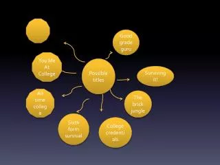
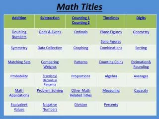
TITLE IDEAS Through trailer analysis I have noticed some trends and style that I like and I will try and experiment with them to find one that is suitable for our film. I will experiment with colour, font, capital, movement and so on. For introducing an actor there are many different combinations. NTOKOZO MOYO NTOKOZO MOYO INTRODUCING NTOKOZO MOYO introducing NTOKOZO MOYO introducing NTOKOZO MOYO NTOKOZO MOYO NTOKOZO MOYO INTRODUCING NTOKOZO MOYO introducing NTOKOZOMOYO introducingNTOKOZO MOYO
The placement of the text could is important to. Introducing NTOKOZO MOYO Introducing NTOKOZO MOYO
This is a quick example of what the titles could look like if incorporated in the shots. The text would have to be a colour that stands out in all the shots because we would want to keep the colour consistent through out like most other trailers. Black would be the most likely to stand out in all the shots but am just experimenting. I have left his name in bold but because he is nota well know star I have put introducing in thinner lower case letters. N the image the clouds are moving quite quickly so depending on how long the shots up for the text might look good moving with the cloud. introducing NTOKOZO MOYO
If we want to use awards we need to think about that to. Does it make sense to just put them on a preset back ground or can we go for something more dynamic with out confusing the viewer and making it too much like an opening sequence. Do we need images? and if so where? WINNER OF 2 ACADAMY AWARDS WINNER OF 2 ACADAMY AWARDS
Do we want the words to blend into the image with colour and position or stand out? WINNER OF 2 ACADAMY AWARDS WINNER OF 2 ACADAMY AWARDS A slight slant means that the text looks more comfortably placed and my matching the most predominant primary colour in the image to the text the image stays looking well framed and balanced. WINNER OF 2 ACADAMY AWARDS WINNER OF 2 ACADAMY AWARDS