Typography Concepts
E N D
Presentation Transcript
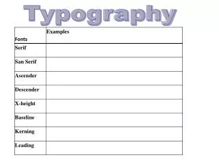
Typography Concepts • Typeface Anatomy • Typeface Categories • Text • Display • Decorative • Emphasis Strategies • Point size/ Measure/ Leading
Typeface Categories- Text • Designed for readability over long passages • Typically serif • Times New Roman • Bookman • Georgia • Verdana
Typeface Categories- Display • Designed for titles and headings • Typically sans-serif • Ariel • Trebuchet • Verdana • Tahoma • Bernhardt Modern Roman
Typeface- Decorative • Designed for stylistic reasons • Typically unprofessional or illegible • Comic Sans • Jokerman • Edwardian Script • Rosewood
Emphasis Strategies • Bold • Italics • Underline • ALL CAPS • SMALL CAPS • Point size • Alignment
Point Size, Measure, and Leading • Point size: Height of typeface, point: 1/72 inch. • Measure: Line length • Leading Space between lines
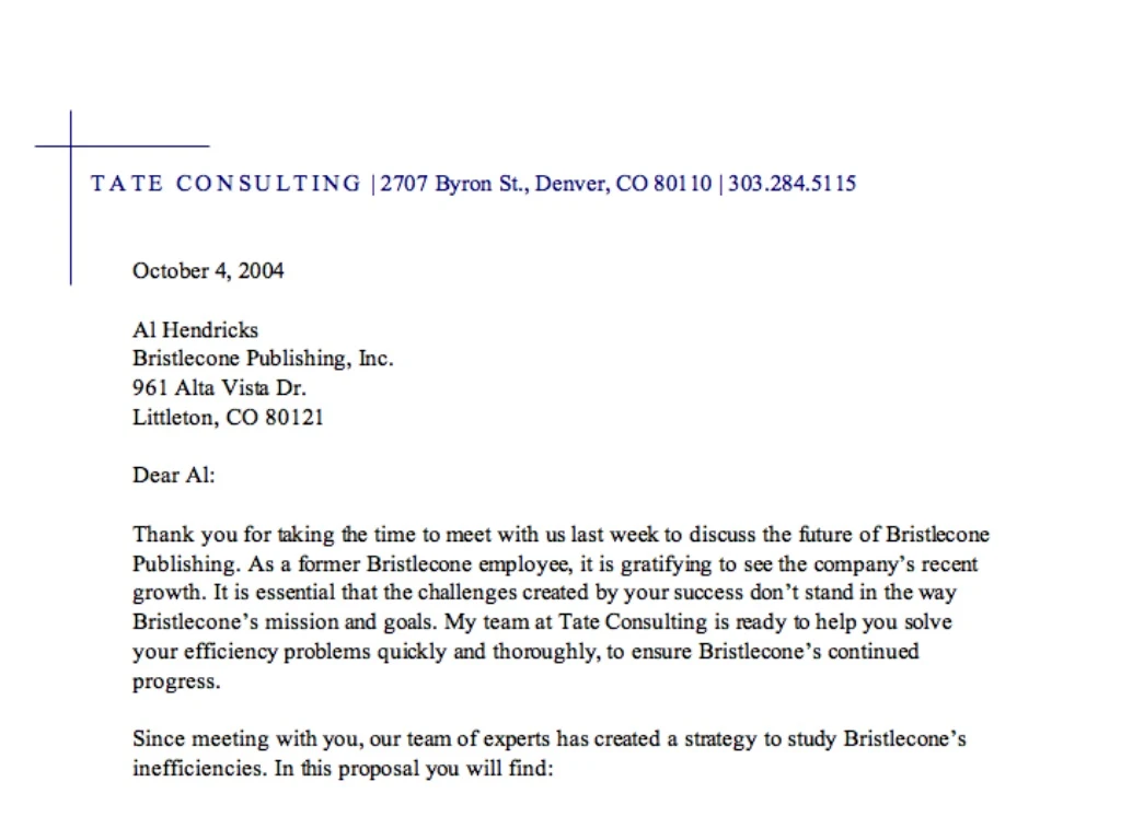
Rules of Thumb • Balance the point size and measure so no more than two lowercase alphabets can fit on each line. • Balance point size and measure so nine to ten words averaging 5 ½ characters fill the measure. • Balance point size and measure so each measure contains between 27 and 70 characters, ideally around 40. • With longer measures more leading is needed to help readers find the next line. • Display type often needs negative leading
