Professional Projection Tips for Your Show
Learn the best practices for projecting presentations. Discover tips on text size, font choice, color contrast, layout cleanliness, and slide ratios for an effective visual display. Make your show visually appealing and easy to read for your audience.


Professional Projection Tips for Your Show
E N D
Presentation Transcript
tips for projection The Show Comes First
Text - tips for projection • Headers should be 36pt-44pt on a 4:3 ratio • Standard body copy size should be 28pt-32pt in size. • Body copy text should never be less than 16pt • Text should be easy to read • San Serif font such as Arial are easier to read than serif fonts • If you use a special fonts, the font must be installed on all computers to read properly
Color - tips for projection • It is important to use high contrast colors • If you use a light background, choose dark colors for text • If you use a dark background, choose light colors for text • Dark blue projects are best for a large room • Avoid using solid white as a background • Solid white is very bright and hurts your eyes during long presentations • Complimentary colors are pleasing to the eye
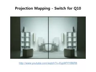
Layout - tips for projection • Keep the layout clean • Try not to use more than 7 bullets • Use the master templates to set up presentations,it keeps the text from jumping slide to slide • Do not over use transitions or animations – they loose their impact the more they are used • Slide content is a recap of what the speaker is saying - not every word • Empty space is important – it gives the eye a break • Images are a nice way to convey messages
4:3 vs 16:9 • PowerPoint automatically sets presentations to a 4:3 ratio • You can change it to a 16:9 ratio by: • Clicking the design • Then Click Page Setup on the far left side of the menu bar • Then click the drop down menu – slides sized for: On Screen Show (16:9)