Download
1 / 35
350 likes | 455 Vues
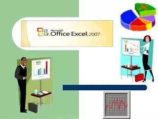
Learn spreadsheet basics, unique functions, chart creation, and more in Excel. Understand data entry, formatting, and analysis.

E N D
AGENDA SPREADSHEETS • Introduction to Excel – what are Spreadsheets? • Functions and their use • Introduction to Charts & Graphs • Individual Activity: BTT PIZZA: EXCEL DATA ENTRY & FORMATTING ACTIVITY
SPREADSHEETS Remember when you see this icon Please copy the notes!
Spreadsheet Software • Spreadsheet programs allow users to perform calculations, which can then be analyzed, graphed, and printed. • Spreadsheet workbook is a file in which you create & work on your data. • Has numerous worksheets or spreadsheet pages, of a grid of vertical columns & horizontal rows.
Spreadsheet Software • The location where each column & row intersect is called a cell and is identified by a cell address. • Bottom of workbook, there are a series of name tabs for each worksheet. • Workbook can contain numerous worksheets & charts that are related to the same topic
Unique Functions • Entering Data into your Spreadsheet • Labels – refer to the text information used to describe the data in the spreadsheet • Values – any numerical data entered is a value • Formulas – all formulas begin with an indicator such as an =, @ sign, or other character. • The order of the elements/parts of a formula is the syntax • Follow the order of operations, (learned in math class) – brackets, exponents, division, multiplication, addition, & subtraction. • When using formulas, you save time when you change the values, as formulas recalculate automatically
Functions • Syntax (format) for keying a formula in Excel • All formulas start with an = sign • ADD =B2+A4 or • SUBTRACT =B2-A4 • MULTIPLY =B2*A4 • DIVIDE =B2/A4 • SUM (A1:D8) or @SUM(A1:D8”)
Converting Data into a Charts & Graphs? • Parts of a Chart • Title – describes the content of the chart so there is no confusion • Legend – indicates which colour represents which category • Data labels • X-axis – the horizontal axis of a column chart • Y-axis - the vertical axis of a column chart
Choosing which Charts • Pie Chart – useful for showing the contribution of each value to the total.
Choosing which Charts • Column & bar Charts – ideal for side-by-side comparisons of data. • Column charts show vertical bars • Bar charts show horizontally on the graph
Choosing which Charts • Line Graphs – great for showing the trend of data over time, example: if you wanted to see the value of the Canadian $$ over the course of a year
Choosing which Charts • Stacked Column & Bar Charts – show the contribution of each value to a total across categories.
SPREADSHEETS AGENDA • Envelopes: Business Letter Mail out! • What are charts & graphs? Why are they important? • Advantages & Disadvantages of charts & graphs • Three most popular types of charts • Independent Activity: Creating the 3 types of charts in Excel • Group Activity: – Skittles Challenge! • Individual Seatwork/Homework: Work through the exercises in your Excel Workbook (pgs. 22-34)
SPREADSHEETS Remember when you see this icon Please copy the notes!
This… Which is better?
This… Which is better?
Convenient methods of showing numbers & data What are Charts & Graphs? • Visual displays of relationships between groups or things
To show & compare changes Why are they Important? • To show & compare relationships • To bring facts to life visually
Quick way to visualize what you are saying Advantages • Emphasizes main point • Convincing – proves a point • More interesting than talk/print • Compact way to convey information
Can be time consuming to make – layout, colour, etc Disadvantages • Technical in nature – audience will need to interpret or understand • Costly – depending on printing medium used
You have 5 seconds, to tell me what are the top 4 Auto Manufacturers… Three types of Charts
You have 5 seconds, to tell me what are the top 4 Manufacturers… Types of Charts
Spreadsheet data are plotted on the X & Y axis • Useful when comparing 2 or more similar items So, what are Bar Charts?
In 5 seconds, I want you to tell me the 5 fruits that make up 50% of my fruit basket… Three types of Charts
In 5 seconds, I want you to tell me the 5 fruits that make up 50% of my fruit basket… Types of Charts
The spreadsheet data are presented as a % of the total amount • Useful when analyzing the composition of a total (example: a budget) Pie Charts
In 5 seconds, tell me which stock is most likely to increase share value in next few years… Three types of Charts
In 5 seconds, tell me which stock is most likely to increase share value in the next few years… Types of Charts
Spreadsheet data are plotted on the X & Y axis as dots • Dots are connected to form a line Line Charts • Useful when analyzing trends in data
Independent Activity:Creating Charts & GraphsONLY when everyone has completed their Charts & Graphs, will we begin the Skittles Challenge!!
The Skittles Challenge! Step 1: You will be working in Pairs. Your partner is…
The Skittles Challenge! Step 2: Step 3: Open up Microsoft Excel1 person from each PAIR will come & choose one plastic bag containing 10 skittlesSort the Skittles according to colour. Note how many of each colour you have.Create a chart & develop the 3 different graphs, to inform your reader of what is inside your bag at a glance. Ensure that the graph is complete (Title, Colours, Amount, etc.) Step 4: Step 5: Step 6: The first 3 pairs to show me their completed graphs, will win a Prize!