Analyzing Correlation in Data Representations
Analyze different types of correlation in graphs and tables, including positive, negative, or no correlation. Learn to determine relationships, draw scatter plots, and calculate slope-intercept forms.

Analyzing Correlation in Data Representations
E N D
Presentation Transcript
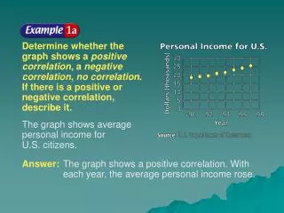
Example 7-1a Determine whether thegraph shows a positivecorrelation, a negative correlation, no correlation. If there is a positive or negative correlation, describe it. The graph shows average personal income forU.S. citizens. Answer: The graph shows a positive correlation. With each year, the average personal income rose.
Example 7-1b Determine whether thegraph shows a positivecorrelation, a negative correlation, no correlation. If there is a positive or negative correlation, describe it. The graph shows the average students per computer in U.S. public schools. Answer: The graph shows a negative correlation. With each year, more computers are in the schools, making the students per computer rate smaller.
Example 7-1c Determine whether each graph shows a positivecorrelation, a negative correlation, no correlation. If there is a positive or negative correlation, describe it. a. The graph shows the number of mail-order prescriptions. Answer: Positive correlation; with each year, the number of mail-order prescriptions has increased.
Example 7-1d Determine whether each graph shows a positivecorrelation, a negative correlation, no correlation. If there is a positive or negative correlation, describe it. b. The graph shows the percentage of voter participation in Presidential Elections. Answer: no correlation
Example 7-2a The table shows the world population growing at a rapid rate.
Example 7-2b Draw a scatter plotand determine whatrelationship exists, if any, in the data. Let the independentvariable x be the yearandlet the dependentvariable ybe thepopulation(in millions). The scatter plot seems to indicate that as the year increases, the population increases. There is a positive correlation between the two variables.
Example 7-2c Draw a line of fit for the scatter plot. No one line will pass through all of the data points. Draw a line that passes close to the points. A line is shown in the scatter plot.
Slope formula Letand Simplify. Example 7-2d Write the slope-intercept form of an equation for equation for the line of fit. Theline of fit shown passes through the data points (1850, 1000) and (1998, 5900). Step 1Find the slope.
Answer: The equation of the line is . Example 7-2e Step 2 Use m= 33.1 and either the point-slope form or the slope-intercept form towrite the equation.You can use either data point.We chose (1850, 1000). Point-slope form Slope-intercept form
Check Check your result by substituting (1998, 5900) into Line of fitequation Replace x with 1998 and y with 5900. Multiply. Subtract. Example 7-2f The solution checks.
Example 7-2g The table shows the number of bachelor’s degrees received since 1988. Source: National Center for Education Statistics
Example 7-2h a. Draw a scatter plot and determine what relationship exists, if any, in the data. Answer: The scatter plot seems to indicate that as the number of years increase, the number of bachelor’s degrees received increases. There is a positive correlation between the two variables.
Answer: Using (4, 1137) and (10, 1184), Example 7-2i b. Draw a line of best fit for the scatter plot. c. Write the slope-intercept form of an equation for the line of fit.
Use the prediction equationwhere x is the year and y is the population (in millions), to predict the worldpopulation in 2010. Original equation Replace x with 2010. Simplify. Example 7-2a Answer: 6,296,000,000
Use the equation where x is the years since 1988 and y is the number of bachelor’s degrees (in thousands), to predict the numberof bachelor’s degreesthat will be received in 2005. Example 7-3b Answer: 1,204,000