Excel Charts: Data Visualization Guide | Essential Chart Types & Techniques
Learn how to create charts in Excel for effective data visualization. Understand different chart types and their applications, customize axes, labels, and formats to enhance your charts.


Excel Charts: Data Visualization Guide | Essential Chart Types & Techniques
E N D
Presentation Transcript
CREATING CHARTS SUBMITTED TO: SUBMITTED BY: MRS. SANDEEP MINAKSHI(6) (ASSISTANT PROFESSOR) KRITI VERMA(30) PEARL SINGLA(36)
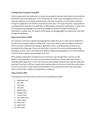
SPREADSHEETS (Charts) Parts of a graph • There are a few elements common to any graph. Data Range • The graph is a pictorial interpretation of data. Generally, you will create a spreadsheet that holds or generates some type of data, then use the graph to illustrate the data. When you define a graph, you will need some way to explain the data being depicted. You can always select the data you want from a spreadsheet range. X and Y axis • As you may remember, the X axis is the horizontal border of the chart. The Y axis is the vertical border. Most spreadsheet programs try to guess what data you want plotted as the X axis and what data you want as the Y axis. If the graph looks completely wrong, you might want to look for some kind of feature that allows you to change the X - Y orientation. Labels There will usually be an option for setting or changing the labels on a graph. This will allow you to put informative labels on the graph to make it easier to read. At the minimum, you should label the X and Y axes. Graph type You have the option to select/change the type of graph that is displayed. The chart type should be chosen carefully and is dependent on the data to be displayed.
SPREADSHEETS (Charts) Main chart types available in Excel
SPREADSHEETS (Charts) • Charts • Used as a data analysis tool. Graphical representations of data are easier to interpret than numbers. • Used as a presentation tool for the same reason. • Chart Types • Column/Bar • Univariate analysis • Data represented as vertical columns or horizontal bars that run from 0 to the value of the datum. • The height of a column corresponds to the magnitude of the datum. • Data values are on the y-axis for a column chart and the x-axis in a bar chart. Opposite axis contains data labels only. • You may chart multiple data series in a single chart for comparison purposes.
Dow Jones Average SPREADSHEETS (Charts) • Chart Types • Line • Univariate analysis • Data represented as single-valued points. • Data values are on the y-axis. X-axis contains data labels only. • Best used for showing a trend over a given period of time.
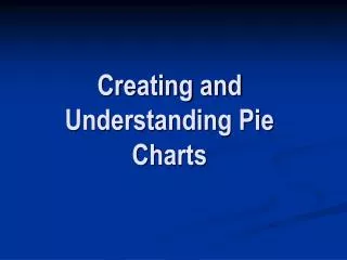
SPREADSHEETS (Charts) • Chart Types • Pie • Univariate analysis • Data represented as an area in a circle expressed as a percentage of a whole. • Number of categories should be kept to a minimum (<10). • “Other” category should represent a small percentage (if used).
SPREADSHEETS (Charts) • Chart Types • Area • Univariate analysis • Combination of pie and line charts. Each x-axis category represents a set of values as a percentage of a whole.
SPREADSHEETS (Charts) • Chart Types • Scatter • Multivariate analysis • Plots x,y coordinate pairs as points so there are actually two values associated with a single point on the chart. • Used to illustrate a dependence of one set of values on the other. Y-axis (dependent).
SPREADSHEETS (Charts) • Creating Charts in Excel • Although not required, it is a good idea to first highlight the data you wish to chart. • Select the Chart Wizard from the Standard toolbar. In the Chart Wizard select the Chart-type and sub-type.
SPREADSHEETS (Charts) • Creating Charts in Excel • In Step 2, there are two tabs (Data Range and Series). If you pre-select the data, then proceed to the Series tab. Name the data series in the “Name:” field. (it appears in the legend on the chart) The worksheet range that holds the values to be charted are located in the “Values:” field. Series can be added or removed here. X-axis labels are added by entering the range in the field shown to the left.
SPREADSHEETS (Charts) • Chart Types • Format the chart by adding x,y-axis labels. There are more options that can be set here. Play around with these options and see what happens. Most of these settings are purely aesthetical.
SPREADSHEETS (Charts) • Creating Charts in Excel • After the chart is created it can be edited via the Chart menu item or by double clicking on the part of the chart you wish to edit.