Download
1 / 20
230 likes | 560 Vues
History of Typography. (History of Digital Font) Robin Chin November 7, 2006. What is “Typography?”. The art and technique of printing The study and “process” of typefaces “Study” Legibility or readability of typefaces and their layout Attractiveness of typefaces and their layout

E N D
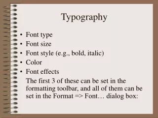
History of Typography (History of Digital Font) Robin Chin November 7, 2006
What is “Typography?” • The art and technique of printing • The study and “process” of typefaces • “Study” • Legibility or readability of typefaces and their layout • Attractiveness of typefaces and their layout • Functionality and effectiveness of typefaces and their layout • How a typeface/layout combo “enhances” or “honors” content • “Process” • Artistic composition of individual type • Setting and arrangement of type • Basic elements of “desktop publishing” • Typeface • A full set of type made to a particular design (size and style) • A font
Some Typeface Examples • Quick brown foxes jump - Times New Roman • Quick brown foxes jump - Bookman Old Style • Quick brown foxes jump - Courier New • Quick brown foxes jump - Trebuchet MS • Quick brown foxes jump - Comic Sans MS • - Webdings
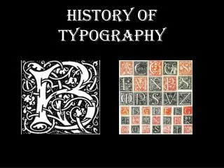
Typography and Print • Typography is defined in relation to print • History of (Western) printing • Johannes Gutenberg • Europe’s first printer (42-line Bible, 1455) • First designer of typeface • Gothic type: modeled after German script • Goal: To replicate the look of a manuscript Bible • Aldus Manutius • Designed “Italic” type (“of Italy”) in the 1490s • Modeled on handwriting of Venetian clerks • Compact form allowed for printing of smaller books
Typography and Print German Script Gothic Type Manutius’ Italic
Typography and Print:Creating Type Basic letterform for capital letters Stone Engravers’ Style: As few curves as possible
Typography and Print:Creating Type Geofroy Tory • 16th Century French Designer • Influenced by architecture and the work of Leonardo da Vinci • Designed his typeface on the proportions of the human body “Anatomy of a letter” - Some terms eventually associated with the potential features of type design (Not Tory, but an example of a full set of typeface)
Typography and Print:Creating Type • Design of the typeface • Creation of physical “type” • Type: (n.) piece of metal in which letter(s) are cast • Gutenberg’s innovation: movable, reusable type • See Robin Chin’s website on “Portability” • From physical type to printed page • The composing sticks: words formed, placed into sticks • The galley: sticks placed together, spaced apart • The chase: galley placed inside, wedges add margins • The form: inked, then placed in the printing press { The “form”
Typography and Print:The Power of Typography • Theory: “Typography honorscontent” • Related theory: typography honors industry and content • Italics example: designed to fit business innovation • Modernist theory: Typography as functional with content • Modernist era: late 19th - early 20th century • Political potential of (experimental) typography • Different “rules” of typographic design - to encourage and discourage certain values in the reading public • Some political artistic groups of the time • Futurist writers (Italy) - destruction is beautiful and necessary! • Imagist poets (England) - the image itself is speech! • Constructivists (Russia) - modernism is functionality!
Typography and Print:The Power of Typography • F.T. Marinetti • Italian poet and founder of Futurism • From Les mots en liberté futuristes, 1919 • “I am starting a typographic revolution, directed above all against the idiotic, sick-making conception of the old-fashioned Poetry Book, with its hand-made paper, its sixteenth century style, decorated with galleons, Minervas, Apollos, great initials …” • “The book must be the futuristic expression of our futuristic thought. Better: my revolution is against among other things the so-called typographic harmony of the page, which is in complete opposition to the style which the page allows.” • Typography takes an active role in the content • Visible as well as audible poetic element • Helped inspire later modernist typographers to use strong contrasts in type sizes and design, and new angles of type
Typography and Print:The Power of Typography • El Lissitzky • Russian constructivist and major artist of “new typography” • “Topgraphy of Typography,” from the magazine Merz, 1922 • “On the printed page words are seen, not heard.” • “Economyof Expression - visual, not phonetic.” • “The new book demands the new writer. Ink-pots and goose-quills are dead.” • “The printed page transcends time and space. The printed page, the infinity of the book, must be transcended. THE ELECTRO-LIBRARY.” • Distinct break from old typography: total discarding of decorative concepts and a turn to functional design Sans-serif Bold, basic colors Use of photography (new-ish technology)
Typography and Print:The Power of Typography • Importance of “new typography” today • A case where the form of printing adapted to fit the conditions of modern life • Declares that “form is not independent, but grows out of function (purpose), out of the materials used (organic or technical), and out of how they are used.”* • Declares that clarity and not beauty is the essence of typography • Declares that asymmetry is generally more optically effective than symmetry * Jan Tschichold
Typography and Print:The Power of Typography • Importance of “new typography” today • Considered blank space to be as much as a formal element of typography as black type • Continued to encourage standardization • Blurred the line between “high art” and “mass media” • Blurred the distinction between image and language • Predicted the future importance of typographic design to advertising
Typography Today • Typography in the digital environment • New process of typeface design • computer programs vs. hand design and casting • New possibilities for layout with the screen • computer programs vs. galleys, etc. • New elements of expression • text and images • sound and animation • screen brightness and contrast • New concept of materiality • pixels vs. ink • links, buttons, IP addresses
Digital Typography • Some digitally adopted typefaces • Times New Roman • 1932, The Times of London Newspaper • Bookman Old Style • 1858, A.C. Phemister in Edinburgh, Scotland • Courier New • 1955, Howard Kettler • Designed as a typewriter face • Commissioned by IBM • Design as a monospaced font (hence easy to align as columns of text) makes it a valuable typeface for coding
Digital Typography • Some digitally created typefaces • Trebuchet MS • 1996, Microsoft typeface designed to be readable at small sizes and at low resolutions • Based on humanist sans serif typeface designs of the 1920s and 30s • Comic Sans MS • 1994 (developed), released as part of Windows 95 Plus! Pack • Based on the generic lettering style of comic strips • (Webdings) • 1997, designed in response to web designers’ need for easy method of incorporating graphics in their pages
Conclusion: Online Reading Practices • Lesson from early history of print • Typographic design is an essential issue in the printing revolution and print culture • Lesson from modernist typography • “Form is not independent, but grows out of function (purpose), out of the materials used (organic or technical), and out of how they are used” - i.e. new reading practices • Lesson from the development of digital fonts • As the webpage borrows from the printed page, so digital font has borrowed heavily from printed typefaces • As the webpage develops further uses distinct from the page, so grows the need to revisit typography, its history, and its future
Conclusion: Online Reading Practices • Aesthetics and computing courses • MAS 962: Digital Typography • Records of digital typographic development • Microsoft typography research group • Digital typography programs • Font-Lab • Publications on digital typography • Donald Knuth’s Digital Typography series
Some Printed Sources and Resources • Drucker, Johanna. The Visible Word: Experimental Typography and Modern Art, 1901-1923 (Chicago: University of Chicago Press, 1994). • McGann, Jerome. The Visible Language of Modernism (Princeton: Princeton University Press, 1993). • Tschichold, Jan. The New Typography: A Handbook for Modern Designers, trans. Ruari McLean (Berkeley: University of California Press, 1995).