Exploring Histograms: Data Analysis Techniques
110 likes | 282 Vues
Learn how to create frequency tables, histograms, and understand the impact of class width on distribution shape using tools like Statdisk and TI calculator. Practice exercises included.

Exploring Histograms: Data Analysis Techniques
E N D
Presentation Transcript
Frequency Tables and Histograms Math 153 – Introduction to Statistical Methods
Objectives • Create a frequency table using raw data obtained from the Internet. • Use Statdisk to create a histogram based on our frequency table. • Use the TI calculator to confirm results. • Understand the effect of the class width on the shape of a histogram.
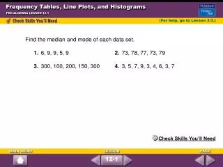
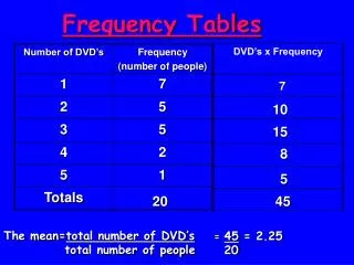
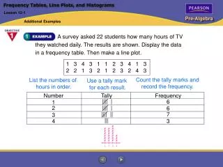
Creating a Frequency Table • It is easier if you sort the data. Use the TI’s sort feature. • Determine the class width using the formula • Convention says to a minimum of five classes and a maximum of twenty classes. • Number of classes will affect the shape of the distribution.
Website Exercise Part 1 • Connect to the URL below and change the number of classes (called bins at the website). Email me what you notice about the change in the shape of the distribution. • Histogram Web Exercise • You will need to have Java enabled in your browser to view this web site.
Creating Graphs Using your TI • Enter the x values of your data into L1. • Select 2nd >> Stat Plot. • Turn plots “on” and then select the histogram option. • Finally, select ZOOM >> ZoomStat to create the best histogram for your data. • If you need further assistance, please go to the TI Tutorial.
Using Statdisk to create Histogram • Enter data in column 1 of the Statdisk data window. • From the menu bar, select DATA >> HISTOGRAM. • Under Plot Options, select USER DEFINED. • Enter your starting point and class width. • Hit the PLOT button. • If you need further assistance, go to your Statdisk tutorial.
Effect of Class Width • Number of classes is 5.*
Effect of Class Width • Number of classes is 2. • This is a very small data set. It’s sole purpose is to show the effect of class width on a histogram.
Effects of Outliers • Outliers are data points that are far away from the general data values. • Like their effect on the mean and standard deviation, they effect the shape of histogram as well.
Homework • Your next web assignment can be found at the Webquest link. Complete all questions using Microsoft Word and Statdisk. Email me your completed project.