Download
1 / 9
150 likes | 511 Vues
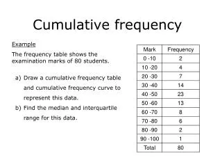
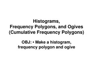
Histograms, Frequency Polygons, and Ogives (Cumulative Frequency Polygons). OBJ: • Make a histogram, frequency polygon and ogive. P.644 #6 The maximum Fahrenheit temperatures at the municipal airport for each of the 30 days of September were:.

E N D
Histograms, Frequency Polygons, and Ogives (Cumulative Frequency Polygons) OBJ: • Make a histogram, frequency polygon and ogive
P.644 #6 The maximum Fahrenheit temperatures at the municipal airport for each of the 30 days of September were:
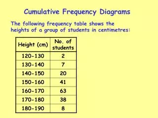
Using the frequency table, we can construct the frequency polygon shown at the right below. Its vertical axis can be labeled as integer frequencies. The horizontal axis of the graph shows the middle score for each class. Note that a frequency polygon is usually drawn so that it begins and ends on the horizontal axis. Frequency Polygon F r e q u e n c y Temperatures
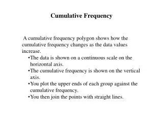
Using a relative frequency table, we can also construct the cumulative frequency polygon (ogive) shown below. Although its vertical axis can be labeled either in integers or percents, the use of percents is most common. The horizontal axis show the largest score for each class. Ogive R C F e u r l m e a u q t l u i a e v t n e i c v y e Temperatures
The temperature data can also be organized and displayed in a histogram with either horizontal or vertical bars, as shown below. Notice that the histogram with horizontal bars looks very much like the stem-and leaf plots created earlier. Also notice that a frequency axis isn’t necessary when the frequency is noted on or near each bar. Stem-and-leaf Plot • 2335556789 • 001223478 • 0344568 • 0123 5|2 means 52º
The temperature data can also be organized and displayed in a histogram with either horizontal or vertical bars, as shown below. Notice that the histogram with horizontal bars looks very much like the stem-and leaf plots created earlier. Also notice that a frequency axis isn’t necessary when the frequency is noted on or near each bar. F r e q u e n c y Temperatures
The temperature data can also be organized and displayed in a histogram with either horizontal or vertical bars, as shown below. Notice that the histogram with horizontal bars looks very much like the stem-and leaf plots created earlier. Also notice that a frequency axis isn’t necessary when the frequency is noted on or near each bar. T e m p a t u r e s Frequency
F r e q u e n c y Temperatures T e m p a t u r e s Frequency Histogram