Cumulative Frequency
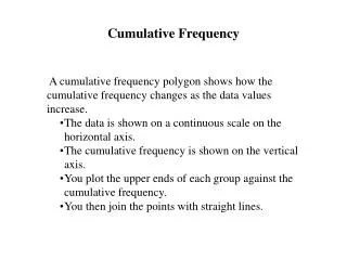
Cumulative Frequency. A cumulative frequency polygon shows how the cumulative frequency changes as the data values increase. The data is shown on a continuous scale on the horizontal axis. The cumulative frequency is shown on the vertical axis.

Cumulative Frequency
E N D
Presentation Transcript
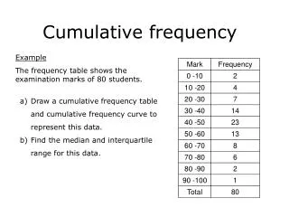
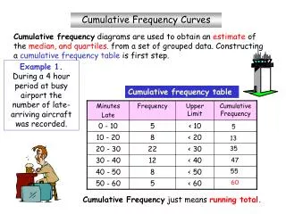
Cumulative Frequency • A cumulative frequency polygon shows how the cumulative frequency changes as the data values increase. • The data is shown on a continuous scale on the horizontal axis. • The cumulative frequency is shown on the vertical axis. • You plot the upper ends of each group against the cumulative frequency. • You then join the points with straight lines.
Cumulative frequency Age (years) Age of People in a Survey
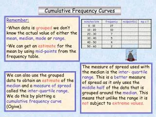
Measures of Spread • Quartiles split data up into four equal parts, or quarters • The Lower Quartile (Q1) is the value one quarter of the way along the data • The Median (Q2) is the value one half of the way along the data • The Upper Quartile (Q3) is the value three quarters of the way along the data • The Inter-Quartile Range is the Upper Quartile minus the Lower Quartile Percentiles and Deciles • Percentiles can give information on the spread of the data • Take the total cumulative frequency as 100% • 10th Percentile is 10% of the total cumulative frequency • 10th Percentile is also called the 1st Decile
Q3 Cumulative frequency Q2 Q1 Age (years) Age of People in a Survey
Lower Quartile Upper Quartile Highest Value Lowest Value Median Cumulative frequency Age (years) Box and Whisker diagram (Box Plot)
Outliers An Outlier may be a value that has been mis-recorded or a value that has been measured and recorded correctly, but does not fall in line with the rest of the data. Outliers are often ignored because they can distort the data. Outliers are values that are unusual in comparison with the rest of the data. • To find any outliers you: • Find the Inter-Quartile Range (IQR), Lower Quartile (LQ) and Upper Quartile (UQ) • Find the value 1.5 times the IQR and subtractfrom the LQ • Find the value 1.5 times the IQR and add to the UQ Any values outside this range are outliers and should be marked on the Box Plot individually • Instead of the Whiskers showing the full range of values you only draw the Whiskers: • up to the highest value that is not an outlier, and • down to the lowest value that is not an outlier
Outliers Lowest Value that is not an outlier Highest Value that is not an outlier outliers x x Cumulative frequency Data: 20, 23, 24, 24, 25, 25, 26, 27, 27, 28, 28, 28, 29, 30, 30, 30, 34, 38, 40 Lower Quartile = 25 Median = 28 Upper Quartile = 30 Inter-Quartile Range = 5 Outliers: 1.5 times IQR = 7.5, outliers are values higher than 30 + 7.5 = 37.5 (i.e. 38 and 40), and values lower than 25 – 7.5 = 17.5 (none)