Histograms and Polygons
160 likes | 347 Vues
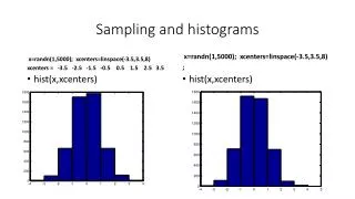
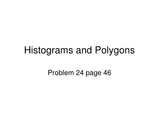
Histograms and Polygons. Problem 24 page 46. Here I copied the data created in the other section. Notice how I put the labels. I put Frequency instead of total. Here I added other columns we will need to make our histograms and polygons.

Histograms and Polygons
E N D
Presentation Transcript
Histograms and Polygons Problem 24 page 46
Here I copied the data created in the other section. Notice how I put the labels. I put Frequency instead of total.
Here I added other columns we will need to make our histograms and polygons. Notice the midpoint is really half way between the two values defining the class. Take the range, divide by 2, and add it to the lower value to get the midpoint. Go to insert on the main menu and scroll to chart.
For a histogram we will want the column chart type and the clustered column sub type. Click next.
Click this box and then get the data in the Percent column – without the label or the total. Then click the box to return. Our data is in columns so make sure that is clicked. Then click next.
Click this box and go get the midpoint data without the label. Click the box again to return.
Note how the midpoint values have been put in here. Then click next.
Put in title, x and y axis labels. I click legend and unclick “show label” box. Click next.
Note the bars have spaces. We do not want this in a histogram. Double click on a bar.
Click the options tab. Then change the gap width to 0. Click OK.
To get a polygon go back to insert chart. Click on the Line Chart Type and pick the sub type as shown. At this you point follow the same directions as for the histogram (except you will not have to shrink spaces between bars).
This is what you get. Notice a similar shape to the histogram.
If you want a cumulative polygon just pick that column of data and repeat what we have done here.