Histograms
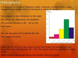
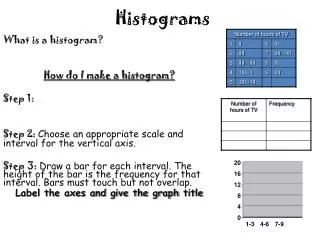
Histograms. A histogram is a type of frequency table. However, instead of the x-axis representing a single value it represents a range of values. For instance in the histogram to the right the yellow bar represents the students who scored between a 40 – 59 on the final exam.

Histograms
E N D
Presentation Transcript
Histograms A histogram is a type of frequency table. However, instead of the x-axis representing a single value it represents a range of values. For instance in the histogram to the right the yellow bar represents the students who scored between a 40 – 59 on the final exam. You can see about 20 students fall into that range of scores. Note: We do not know any exact scores from these 20 students we only know that they fall between 40 – 59. The scores could be anywhere in that range. What interval represents where the median test score falls?
Video and Practice • http://www.youtube.com/watch?v=AN54uuIzNt8 • Find the ranges of the lower quartile, the upper quartile and the median of the histogram above.
A normal shaped distribution has most of the data in the middle and then gets smaller as the data get farther from the center. A skewed left shape distribution has the majority of the data on the left and then get smaller as the data goes further to the right. Will have upper extreme outliers. A skewed right shape distribution has the majority of the data on the right side and then gets smaller as the data goes further to the left. Will have lower extreme outliers. A bi-model shape distribution has 2 clear highpoints separated apart from each other.
2 way Frequency Tables • A 2 way frequency table relates 2 categories together, and puts the values into a readable chart on what the categories have in common. • Relative frequency means the to find the percent of a category compared to one of the totals. This is found by % = 1. How many people like both action and comedy? 2. How many people like just Comedy? 3. What is the relative frequency of people who like just action to the total action lovers? 4. What is the relative frequency of people who do not like either to the total number of people?
Creating a 2 way frequency Table There are 150 children at summer camp and 71 signed up for swimming. There were a total of 62 children that signed up for canoeing and 28 of them also signed up for swimming. Construct a two-way table summarizing the data. Step 1: Determine the Categories. Step 2: Use the information to fill in the spaces. Step 3: Use logic and Reasoning to fill in the blanks.
Practice: Create a 2 way frequency table using the information below, and then answer the questions at the bottom. A class was surveyed about whether they have been to Canada or Mexico. 6 people said they have been to both. 3 people said they have only been to Mexico. 11 people said they have not been to either. There was a total of 16 people who have not been to Mexico. 1) Create a 2 way frequency Table for the data 2) How many students how only been to Canada? 3) What is the relative frequency of students who have only been to Canada to the total number of students who have been to Canada? 4) What is the relative frequency of students who have been to both to the total number of students?

