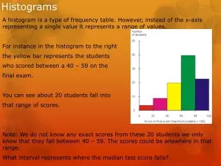
Histograms
Learn the basics of histograms - a graphic representation of quantitative data divided into classes with rectangles showing frequencies. Discover how to draw, analyze, and interpret histograms effectively.

Histograms
E N D
Presentation Transcript
Histograms Lecture 14 Sec. 4.4.4 Tue, Sep 26, 2006
Histograms • Histogram – A display of quantitative data in which the data are divided into classes, with rectangles representing the frequencies of the classes.
Histograms vs. Bar Graphs • Histograms appear to be very similar to bar graphs. • However, bar graphs are for qualitative data, while histograms are for quantitative data. • We indicate this difference by leaving a gap between the bars of a bar graph and no gap between the rectangles of a histogram.
Example • Draw a histogram of the following data.
Drawing Histograms • Find the maximum value, the minimum value, and the range. • Minimum = 1.344 • Maximum = 3.855 • Range = Max – Min = 3.855 – 1.344 = 2.511.
Drawing Histograms • Divide the data into classes of equal width. • The classes must not overlap. • Choose a convenient starting point. • Choose a convenient class width. • It works best if the starting point is a multiple of the class width, but that is not necessary. • Write the endpoints of each class.
Drawing Histograms • Let’s use 6 classes • Then the width must be at least 2.511/6 = 0.4185. • Let’s use 0.5 (other choices are possible). • Starting point = 1.0 (other choices are possible).
Drawing Histograms • Classes: • 1.0 up to 1.5 (but not including 1.5) • 1.5 up to 2.0 • 2.0 up to 2.5 • 2.5 up to 3.0 • 3.0 up to 3.5 • 3.5 up to 4.0
Drawing Histograms • We may write the classes in either of two ways. • Interval notation: [low, high) • [1.0, 1.5), • [1.5, 2.0), • [2.0, 2.5), etc. • [ and ] mean “include endpoints.” • ( and ) mean “exclude endpoints.”
Drawing Histograms • Range notation: low – high • 1.000 – 1.499, • 1.500 – 1.999, • 2.000 – 2.499, etc. • With this notation, the endpoints are assumed to be included. • Therefore, be sure the endpoints do not overlap. • Yet be sure that no possible values are left out.
Drawing Histograms • Count the number of observations in each class. This is the frequency of the class.
Drawing Histograms • Draw horizontal and vertical axes. • On the horizontal axis, show the class limits. • On the vertical axis, show uniform reference points representing frequencies or precentages that are appropriate for the data, starting at 0. • For example, 0, 2, 4, …
Frequency 8 6 4 2 GPA 0 1.0 1.5 2.0 2.5 3.0 3.5 4.0 Drawing Histograms
Drawing Histograms • Over each class, draw a rectangle whose height is the frequency, or relative frequency, of that class.
Frequency 8 6 4 2 GPA 0 1.0 1.5 2.0 2.5 3.0 3.5 4.0 Drawing Histograms
Frequency 8 6 4 2 GPA 0 1.0 1.5 2.0 2.5 3.0 3.5 4.0 Drawing Histograms
Frequency 8 6 4 2 GPA 0 1.0 1.5 2.0 2.5 3.0 3.5 4.0 Drawing Histograms
Frequency 8 6 4 2 GPA 0 1.0 1.5 2.0 2.5 3.0 3.5 4.0 Drawing Histograms
Frequency 8 6 4 2 GPA 0 1.0 1.5 2.0 2.5 3.0 3.5 4.0 Drawing Histograms
Frequency 8 6 4 2 GPA 0 1.0 1.5 2.0 2.5 3.0 3.5 4.0 Drawing Histograms
Frequency 8 6 4 2 GPA 0 1.0 1.5 2.0 2.5 3.0 3.5 4.0 Drawing Histograms
Drawing Histograms Frequency 8 6 4 2 GPA 0 1.0 1.5 2.0 2.5 3.0 3.5 4.0
Drawing Histograms • Never use too few or too many classes. • Usually 5 to 12 classes is about right. • Use simple round numbers for the class boundaries. • Mark off the vertical axis uniformly, showing regular reference points, not the actual frequencies. • The vertical scale must start at 0.
TI-83 – Histograms • Enter the data into list L1. • {2.946, 2.731, 2.881, …, 3.053} L1 • Press STAT PLOT • Select Plot1. • Press Enter. • Turn Plot1 On. • Select Histogram Type. • Specify List L1.
TI-83 – Histograms • Press WINDOW • Set Xmin to the starting point. • Set Xmax to the last endpoint. • Set Xscl to the class width. • Set Ymin to 0 (or -1 for a margin). • Set Ymax to the maximum frequency. • Press GRAPH • The histogram appears.
TI-83 – Frequency Distributions • After getting the histogram, press TRACE. • The display shows the first class and its frequency. • Use the left arrow to see the other class frequencies.