Understanding Histograms: A Comprehensive Guide for Data Visualization
This guide introduces histograms, illustrating their design and purpose in data analysis. A histogram resembles a bar graph but segments data into ranges, using rectangular bars to display the frequency of data values within each range. It may serve to visualize data such as weight, height, age, and time. The process includes collecting data, selecting ranges, and creating the histogram using tools like Microsoft Excel or manually drawing it. Learn to recognize trends, assess data frequencies, and appreciate the advantages and limitations of histograms.

Understanding Histograms: A Comprehensive Guide for Data Visualization
E N D
Presentation Transcript
Histograms Presented by William2! (William Chen and Gulian)
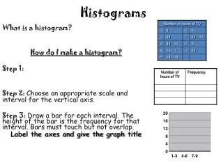
What it is • A histogram looks like a bar graph but instead divides the data set into different ranges. Over each range is placed a block or rectangle whose height represents the number of data values in the range. • A frequency histogram uses vertical columns to show frequencies (without using ranges) such as : • How many times a score occurs
When to use • To group numbers in a data set into ranges • Weight • Height • Age • Time • Show frequencies (without using ranges)
Data needed • One numerical data set • Ranges to group the data set in (unless creating a frequency histogram) • Title • Axes Labels
Real Life Example • How long is your bus ride to/from school? • Your answers (in min.):
How we did it Prerequisites (for both): • Collect data. • Decide ranges to group data in.* Computer: • Enter data in Microsoft Excel. • Select data and insert Column/Bar Graph. • Select the bars on the chart, right-click, then select “Format Data Series”. • Slide the “Gap Width” slider all the way to “No Gap”. • Customize so it is creative/original! Handwritten: • Draw x- and y- axes and label the x-axis as your ranges/numbers and your y-axis as frequencies. • Draw your bars like in a bar graph but with no gaps in between. (This is a difference between a bar graph and histogram.) • Decorate! *Skip step if you are creating a frequency histogram. (If you are making a frequency histogram, don’t use ranges.)
Checking for Understanding • What percentage of the class has bus rides longer than 20 minutes? • About 43%
Advantages vs. Disadvantages • Numbers are grouped into ranges so that trends can be observed • Can show frequencies • Actual data (numbers) not actually seen • Can only graph one data set
Thank you! http://www.mathsisfun.com/data/histograms.html http://www.google.com/imghp?hl=en&tab=wi The combined brainpower of William2!