Histograms
Histograms. AP Statistics. Histograms. Step 1: Divide the range of the data into classes of equal width. Count the number of observations in each class. Be sure to specify the classes precisely so that each observation falls into exactly one class

Histograms
E N D
Presentation Transcript
Histograms AP Statistics
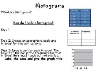
Histograms • Step 1: Divide the range of the data into classes of equal width. Count the number of observations in each class. Be sure to specify the classes precisely so that each observation falls into exactly one class • Step 2: Label and scale your axes and title your graph. Label the horizontal axis and vertical axis • Step 3: Draw a bar that represents the count in each class. The base of a bar should cover its class, and the bar height is the class count. Leave no horizontal space between the bars (unless a class is empty so that its bar is at 0.
Histogram Tips • Tip 1: There is no one right choice of the classes in a histogram. Too few classes will give a “skyscraper” graph whereas too many will provide a pancake graph. Neither choice will give a good picture of the shape of the distribution • Tip 2: Five Classes is a good minimum • Tip 3: Our eyes respond to the area of the bars in a histogram, so be sure to choose classes that are all the same width. Then the area is determined by height and all classes are fairly represented. • Tip 4: If you use a computer or graphing Calculator, beware of letting the device choose the classes.
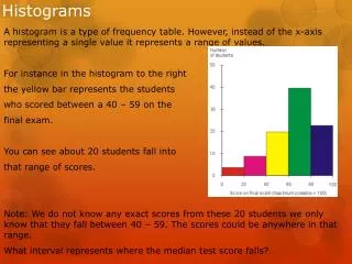
Example 1.6 page 19 How old are presidents at their inaugurations? Was Bill Clinton, at age 46 unusually young? Table 1.4 Gives the data, the ages of all US presidents took office. After Reviewing the histogram, describe the distribution.
Pres STAT and then EDIT Put the president’s ages in to list 1 Histograms on the Calculator
Now Lets Change our Window. We want classes of equal length that contain the entire spread. Lets use the classes on our books histogram