Download

1 / 6
90 likes | 146 Vues
Learn about histograms, a type of bar graph used to display frequency distribution of grouped continuous data. Discover how they differ from dot plots and box plots, and understand how to interpret the information they convey effectively.

E N D
What is a histogram? You might recognize this type of graph. It is a bar graph. The height of each bar corresponds to the frequency of the given category. Housing types in town 35 30 25 20 15 frequency 10 5 0 B C D E F A Housing type This graph is a histogram. Heights of students 35 30 25 What differences do you notice about this type of graph? 20 15 Frequency 10 5 0 155 160 165 170 175 180 185 150 height (cm)
Histograms Histograms are used to display groupedcontinuous data. • The frequencies go on the vertical axis. • The class intervals go on the horizontal axis. • The class intervals should all be the same width. • There are no gaps left between the bars, to show that the data is continuous. • The highest and lowest possible values in each interval go at either end of the bar: 80 85 90 • The axes should always be labelled.
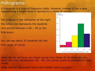
Interpreting histograms The histogram shows the track times of some 10th grade girls. 12 10 8 frequency 6 4 2 0 95 100 105 110 115 120 125 130 135 time in seconds Discuss what the histogram shows.
Dot plots Here are the points scored by students on a math test:4.2, 4.4, 5.1, 5.6, 6.1, 6.4, 6.8, 7.1, 7.2 7.4, 7.4, 7.9, 8.2, 8.2, 8.2, 9.1, 9.6, 9.6, 10.0 Draw a histogram of the data. We can plot this data on another type of diagram called a dot plot: Compare the diagrams and discuss the advantages of each type.
Comparing to box plots The points scored by students on the math test are: 4.2, 4.4, 5.1, 5.6, 6.1, 6.4, 6.8, 7.1, 7.2, 7.4, 7.4, 7.9, 8.2, 8.2, 8.7, 9.1, 9.6, 9.6, 10.0 Draw a box plot of the data.Compare the two diagrams. • Both diagrams show that the data is negatively skewed. • The distribution is a lot clearer in the histogram. • The box plot provides exact values for the maximum and minimum values.