Typography
E N D
Presentation Transcript
Typography • Conveys mood • Communicates attitude
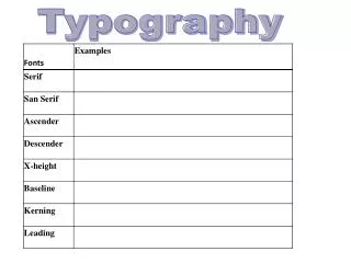
The Letters • X-height –the height of the main body of a lower case letter (literally, the x) x j • Cap height –the height of uppercase letters of a font A B C
The Letters • Ascender – the part of lower case letters that extends above the x-height b d h • Descender – the part of lower case letters that extends below the baseline g p y
The Letters • Bowl – the rounded space within letters such as b and Q • Serif – the short cross strokes of some typeface T f m
Typefaces • Conventional Serif, small x-height, tall extenders & descenders • Contemporary Sans serif, high x-height, short extenders and descenders
Typefaces • Dignified Serif, bowls and vertical letterforms slightly narrowed Hattenschweiler • Friendly Rounded bowls and letterforms Tahoma
Type Styles • Bold heavier stroke, -headings, subheads -avoid using bold type for emphasis within blocks text. Italics work better.
Type Styles Avoid: Shadow text Outline text Underlined text Consider: Small caps for acronyms
Type measurement Points –best standard of measurement Measured in smaller increments 0.1 Used by most programs Vocabulary of typesetting is in points Used for line spacing and rule thickness 6 picas = 1 inch 12 points = 1 pica 72 points = 1 inch
Kerning and Tracking Kerning – reducing or adding space between letter pairs Tracking - adjusting space in a string or block of text generally loose or tight
Line Spacing • Leading –vertical space alloted to a line of type Use tighter leading in headlines Use looser leading for body text
Leading Design programs allow you to adjust leading for special effects, such as logos
50% off 50% off Special Type Effects Reversing type Screening type
Special Type Effects compressing and type Rotating type Setting Stretching Rotating type Rotating type along a path
Special Type Effects • Filling type Legibility over Novelty
