Download
1 / 5
50 likes | 114 Vues
Learn how to achieve balance in design compositions by resizing, moving, and aligning text and graphics. Discover how unity and consistency can enhance your layouts for improved visual appeal and readability.

E N D
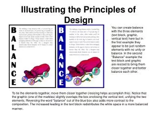
Illustrating the Principles of Design You can create balance with the three elements (text block, graphic, vertical text) here but in the first example they appear to be just random elements with no unity or balance. In the second "Balance" example the text block and graphic are resized to bring them closer together and better balance each other. To tie the elements together, move them closer together (resizing helps accomplish this). Notice that the graphic (one of the marbles) slightly overlaps the box enclosing the vertical text, unifying the two elements. Reversing the word "balance" out of the blue box also adds more contrast to the composition. The increased leading in the text block redistributes the white space in a more balanced manner.
The graphic anchors the bottom of the page, but the four text elements all float on the page with no apparent connection to each other (proximity/unity). The change in the headline (font change, reversed out of blue box) along with the subheading pulled in closer provides balance with the graphic on the bottom. The spacing between the two paragraphs of text is reduced slightly as well.
There is nothing inherently wrong with centered headlines, text, and graphics. They lend a formal tone to a layout. But, for this series of layouts something a bit more informal is called for. Also, large blocks of centered text are usually harder to read. In the second "Alignment" example, text alignment is left-aligned, ragged right, wrapped around the bottom graphic which is aligned more to the right, opposite an added graphic that is aligned to the right to help balance the overall design.
Within the second "Repetition" example, the headline is repeated three times using graphics that tie in with the copy in the text blocks. The repetition of the colors in the shapes and headline text that are in the copy help to reinforce the theme. Overlapping the graphic and text elements unifies the elements of the design. Another aspect of consistency that can be seen when viewing all 6 of the "after" examples is the blue borders, blue reversed boxes, and the typeface (Britannic Bold) used for the names of all the principles of design. The drop cap used in three examples (Bermuda LP Squiggle) is another element of consistency.
There's isn't enough contrast between the headline and text due in part to size but also because the two different serif faces used or too similar (not obvious from the small graphic, trust me, they are different typefaces). That oversized graphic provides real contrast and reinforces the copy (tall basketball players). Dropping the text down to the bottom portion of the page also reinforces the 'towering' aspect of the graphic. The reversed text in the blue box, the blue border, and the drop cap carries through the overall unifying elements found throughout the series. Additionally, the round shape of the drop cap and its color echo the shape and color of the basketball in the graphic. The drop cap and the reversed text on the left side plus the left-aligned text help to balance the large graphic element.