THE 7 BASIC QUALITY TOOLS
THE 7 BASIC QUALITY TOOLS. Susan Batchilder. January 24, 2013. Group Activity: WHAT ’ S IN YOUR TOOL BOX?. What is the purpose of your personal toolbox? cleaning, fixing, remembering, coaching, etc… What ’ s in your personal tool box? When did you last use your tool box?


THE 7 BASIC QUALITY TOOLS
E N D
Presentation Transcript
THE 7 BASIC QUALITY TOOLS Susan Batchilder January 24, 2013
Group Activity:WHAT’S IN YOUR TOOL BOX? • What is the purpose of your personal toolbox? • cleaning, fixing, remembering, coaching, etc… • What’s in your personal tool box? • When did you last use your tool box? • Do you have a tool box for your job? • What is the purpose of your tool box for work?
QUALITY TOOLS • Purpose: provide the means for making decisions. • No particular tool is mandatory, any one may be helpful, depending on the circumstances. • 95% of a company’s problems can be solved using these tools. • These are basic tools designed for simplicity. • Only one requires any significant training. Question: What tools do YOU use for making decisions in YOUR job?
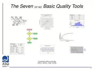
7 BASIC QUALITY TOOLS • FLOW CHART • CAUSE AND EFFECT DIAGRAMS • CHECK SHEET • HISTOGRAMS • PARETO CHART • SCATTER DIAGRAM • CONTROL CHARTS Question: Why do we use these tools?
QUALITY TOOLS CAN… • Help to identify and prioritize problems quickly and more effectively • Assist with the decision making process • Simple but powerful tools for use in continuous improvement activity • Provide a vehicle for communicating problems and resolutions through-out the business • Provide a way of extracting information from data collected.
STRATIFICATION • The 7 Quality Tools are useful when collecting data of daily activities and analyzing them to detect and solve problems, and an important concept for data analysis is STRATIFICATION. • Stratification mean classification of data in to a couple of layers, and each layer is a subset of the population. • Through stratification different statuses from the same data is retrieved. • What layers are considered for data analysis is crucial when identifying problems.
Example of Stratification • Number of births per year • Number of births by gender per year • Number of births by mom’s economic status by gender per year • deliveries per week • deliveries per day of the week per week • deliveries by hour per day of week per week • DANAGER: When using stratification ensure it is value added
FLOW CHARTS • Purpose: Illustrates the steps in a process • Uses: • Analyzing a process (e.g. relating one setp in the process to others) • Initiate process improvements (e.g. non-value added steps) • Indicates where in the process to take measurements and collect data • DANGER: including assumed or desired steps • Note: The utility of the chart will correlate directly to its accuracy.
CAUSE AND EFFECT DIAGRAMS • Purpose: to identify as many possible factors for an effect or problem and sort the causes into useful categories. • When to use? • Identifying possible factors • When team’s thinking falls into a “rut” • Fishbone (most common) • Generic categories: Methods, Machines, Materials, Manpower, Measurement, Mother Nature
HOW TO CREATE A FISHBONE CAUSE AND EFFECT DIAGRAM Manpower Machines Methods Problem Statement “Effect” Management Mother Nature Measurement Materials Maintenance
CAUSE AND EFFECT DIAGRAMS • Other fishbone categories: • Plan, Policies, Procedures, Plant, People • Customers, Suppliers, Shipping, Warehouse… • 5 WHYS: a method for getting to the root cause. • Can also be used during the construction of the fishbone diagram. • GROUP ACTIVITY TIME – Let determine the cause of a particular problem. Please give me a problem statement and we’ll use the 6M’s.
GROUP ACTIVITY TIME Manpower Machines Methods Problem Statement “Effect” Mother Nature Measurement Materials
CAUSE AND EFFECT DIAGRAMSNow What? • Categorize (e.g. not probable, probable, very probable) • Regression analysis (requires in-depth training) • Design of experiments (requires in-depth training) • Lets go back to our example and determine what our next steps will be. • Do you remember the first time you heard about a check list with regards to data collection?
CHECK SHEET • WHAT: A structured and prepared form. • PURPOSE: To collect and analyze data so decisions can be based on facts • WHEN: • When data can be observed and collected by the same person or at the same location. • When collecting data on the frequency or pattern of events, problems, defects, defect location, defect causes, etc. • When collecting data from a production process. • Data can further be used to create a histogram, bar chart and Pareto chart
A Check List Can Become … A Bar Graph
HISTOGRAM • WHAT: A frequency distribution bar graph • USES: • Illustrates how often each different value in a data set occurs • Allows us to make sense of data • Allows use to see patterns that are difficult to see in tables of numbers • DANGER: Before making any conclusions from a histogram, it must be confirmed the process was operating normally during the time period being studied
SCATTER DIAGRAM • WHAT: Scatter diagram graphs PAIRS of numerical data. • PURPOSE: To look for a possible relationship • DANGER: Even if the scatter diagram shows a relationship, do not assume one variable causes the other. Both variable may be influenced by a third.
Scatter Diagram Examples Graph 1 – strong correlation (linear) Graph 2 – moderate correlation Graph 3 – no correlation Also – quadratic, exponential, sinusoidal, and others
PARETO CHART • What: Bar graph organized with the longest bars on the left and the shortest to the right • Purpose: Problem identification tool --- Visually depicts which issues are more significant • Use when… • Analyzing data about the frequency of problems/causes in a process • There are many problems/causes and there is a need to focus on the most significant • Analyzing broad causes by looking at their specific components • Communicating data to others
PARETO PRINCIPLE 20/80 RULE • THE IDEA THAT 20% OF THE CAUSES GENERATES 80% OF THE RESULTS With the Pareto chart we are identifying the “vital few” from the “trivial many”.
CONTROL CHARTS • What: A statistical graphical representation used to study how a process changes over time • Purpose: To distinguish between variation in a process resulting from common causes, and variation resulting from special causes. • Data are plotted in time order. • Graphs include a central average line, a upper control limit line and a lower control limit line determined from historical data.
Types of Control Charts • Variable (continuous data – measureable) • X-bar Chart (average) • R chart (range) • s chart (deviation) • X chart (single data point – individual) • Moving range chart • XmR (individual with moving range) • Attribute (discrete data – count) • p chart (percentage of defective units) • np chart (number of defective units) • c chart (number of defects per unit) • u chart (average number of defects per unit)
OTHER TOOLS • 5 WHYs (previously mentioned) • Brainstorming • Time Line • Fault Tree Analysis • Process Analysis
WHY ? WHY ? WHY ? WHY ? WHY ?
5 WHY’S – an example • Problem --- Why is memorial A deteriorating faster than the other memorials? • Why? –washed more frequently • Why? –more bird droppings • Why? –birds attracted to monument • Why? –more fat spiders around it • Why? –more tiny insects during evening hours • Why? –illumination attracts more insect • Solution • Illuminate an hour later in evening
5 WHYs Process Best Practice PROBLEM PROBLEM WHY? WHY? WHY? WHY? WHY? WHY? WHY? WHY? WHY? WHY? WHY? WHY? WHY? WHY? WHY? WHY? WHY? ROOT CAUSE MULTIPLE POTENTIAL ROOT CAUSES
Brainstorming • Can be performed by an individual or a group • Classic Example – write down anything that comes to mind • Ask questions – 5 Whys • Categorize – Fishbone • Many others
TIME LINE • A presentation of a chronological sequence of events along a drawn line that enables the reader to quickly understand relationships relating to, or limited by, time • Lines are usually drawn from left to right or top to bottom • Example --- murder mysteries, time line of events before and up to the time of death
FAULT TREE ANALYSIS (FTA) • WHAT • A graphic representation of the major faults or critical failures associated with a product, the causes for the faults, and potential countermeasures. • WHY • It helps to identify areas of concern for new product design or for improvements of existing products. • It helps to identify corrective actions to correct or mitigate problems.
FTA – When to use? • Designing new products/services • Dealing with identified problems in existing products/services • To optimize process features and goals • To design for critical factors and human error • To help identify root causes of trouble • To design remedies and countermeasures
PROCESS ANALYSIS • An operation (e.g. business) is composed of processes designed to add value by transforming inputs into useful outputs. Processes can have a significant impact on the performance of a business and process improvements can improve competitiveness. • A process analysis is performed when the process (as a whole or as a part) needs to be better understood.
Process Analysis • Processes are analyzed to better understand their: • Activities • Relationships • Values of relevant metrics • Process analysis generally involves the following tasks: • Defining process boundaries (input/output) • Process flow diagram • Determining capacity of each step of process • Identifying limiting step(s) • Using analysis to make business decisions and improvements
Process Analysis – Performance Measurements - • Process Capacity • Capacity Utilization • Throughput rate • Throughput time • Process time • Idle time • Work In Process • Set-up time • Direct Labour Content • Direct Labour Utilization
WHY DO TECHNIQUES FAIL? • Problem solvers might question themselves • Am I using the tool correctly? • Is there a misconception in using the tools to find the root cause of problems? • Is there another technique to help me go beyond the basic cause and effect analysis and get better results when investigating issues?
COMMON “DANGERS” • Only tool • Confirmation Bias • Unable to go beyond current knowledge • Human Factors • Single Cause
COMMON “DANGERS”– Only Tool - • Many believe cause and effect analysis is the only, or preferred method to find root causes • Avoid this misconception • You CAN modify approaches, and use other tools alone or in combination