Chapter 4 Graphing I. Why? Describes data visually, more clearly. Frequency Distribution
80 likes | 104 Vues
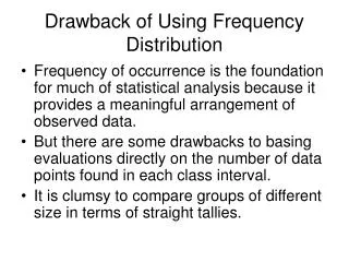
Chapter 4 Graphing I. Why? Describes data visually, more clearly. Frequency Distribution Class Interval Column – divides the scores up into categories (0-4, 5-9, etc.). Usually range of 2,5,10, or 25 data points. Main thing: be consistent!

Chapter 4 Graphing I. Why? Describes data visually, more clearly. Frequency Distribution
E N D
Presentation Transcript
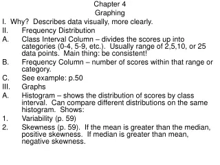
Chapter 4 Graphing I. Why? Describes data visually, more clearly. • Frequency Distribution • Class Interval Column – divides the scores up into categories (0-4, 5-9, etc.). Usually range of 2,5,10, or 25 data points. Main thing: be consistent! • Frequency Column – number of scores within that range or category. • See example: p.50 • Graphs • Histogram – shows the distribution of scores by class interval. Can compare different distributions on the same histogram. Shows: • Variability (p. 59) • Skewness (p. 59). If the mean is greater than the median, positive skewness. If median is greater than mean, negative skewness.
Skewness If the data set is symmetric, the mean equals the median. Median Mean
Skewness If the data set is skewed to the right, the mean is greater than the median. Mean Median
Skewness If the data set is skewed to the left, the mean is less than the median. Mean Median
B. Column Charts – used to compare frequencies of different categories with one another; simply tells the quantity of a category according to some scale. Categories are on the x-axis and values (scores) on the y-axis (p. 63 example). SCALE IS IMPORTANT (CSPAN-drug use story). • Bar Charts – same as Column chart, but reverse the axes. • Line Chart – Used to show trends (e.g. rise and fall in pres. popularity – line on our website or see example p. 64). • Pie Charts – Great for proportions (percent of MS budget going to each budget category, like education). • SPSS and Graphing: Exercises in class (Histogram, Bar, Line).